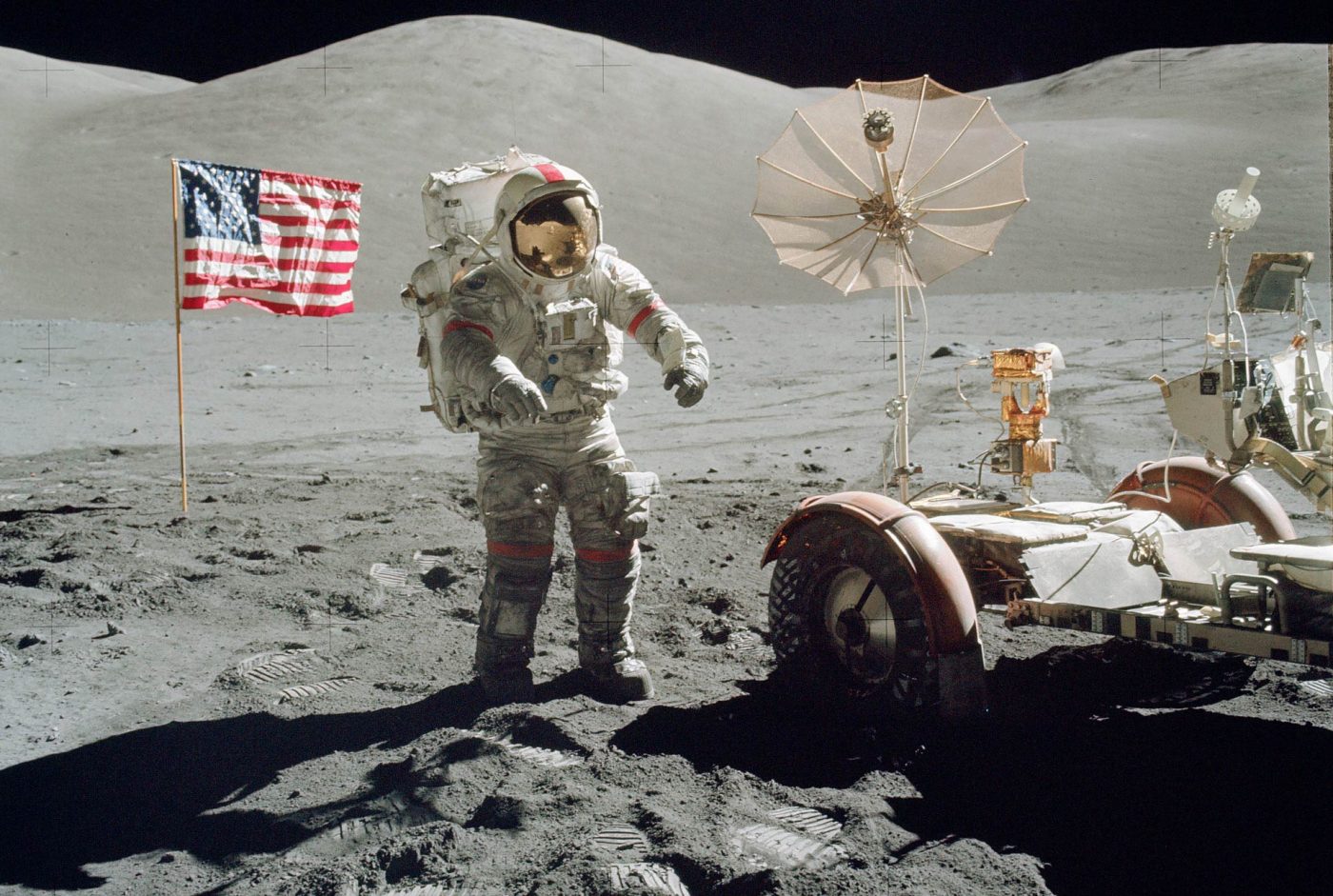
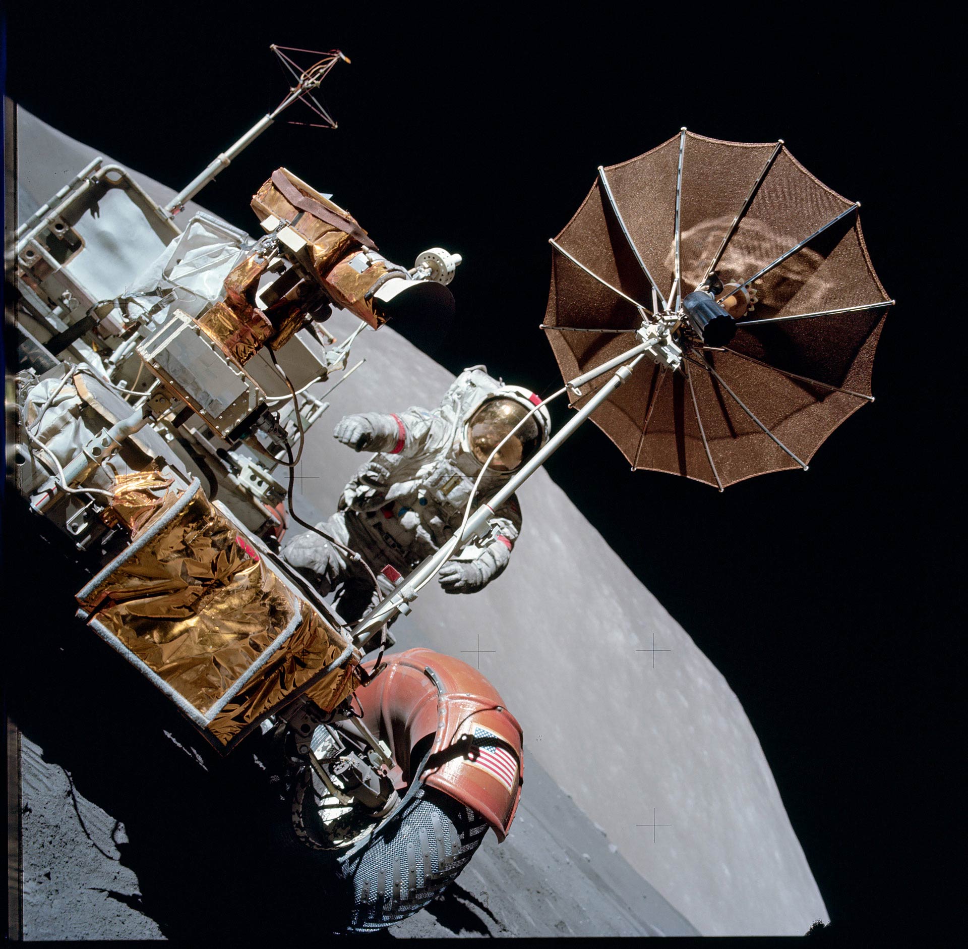
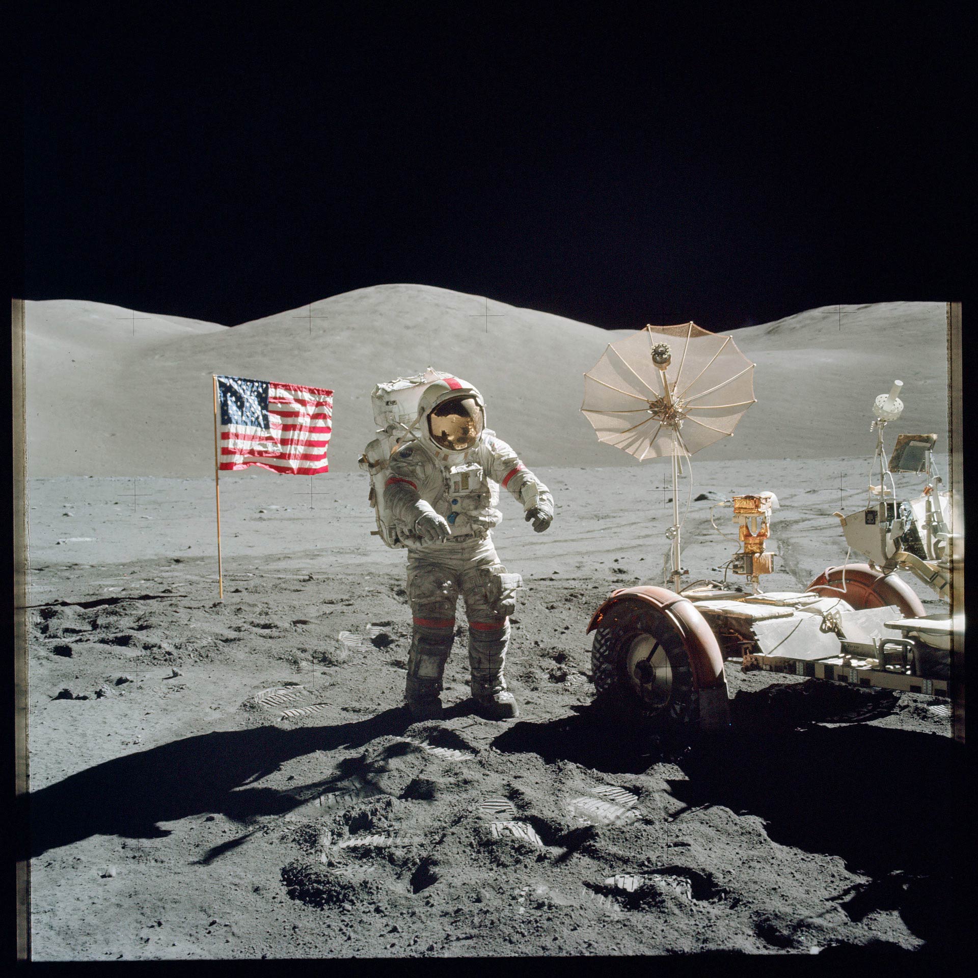
On Monday, NASA posted its entire archive of Apollo mission photos from the 1960s and ’70s on flickr, and they’re gorgeous. They’re all from medium format, square images shot with Hasselblad cameras, and scanned at 1800ppi, making the files just under 20 megapixels each, and they’re all in the public domain.
Some of the images are already iconic, but the vast majority of them are new to me, and I’ve now spent countless hours enthralled by them. Perhaps it’s the years that I spent processing and gazing at rolls of negatives, but there’s something about looking at a dozen mediocre images… some in focus, some poorly framed, others under-exposed, some with motion blur… that increases the impact and brings home the reality of all of them.
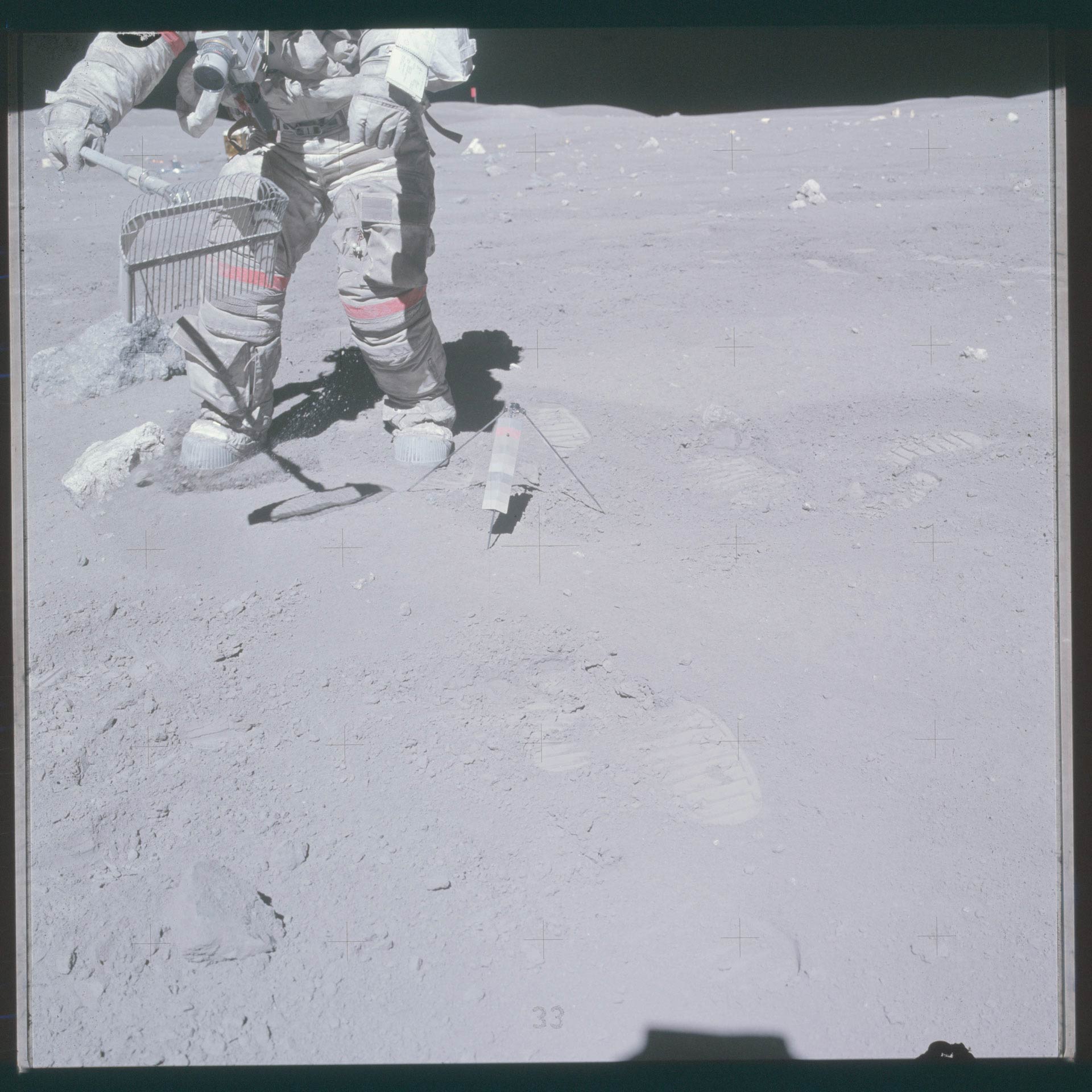
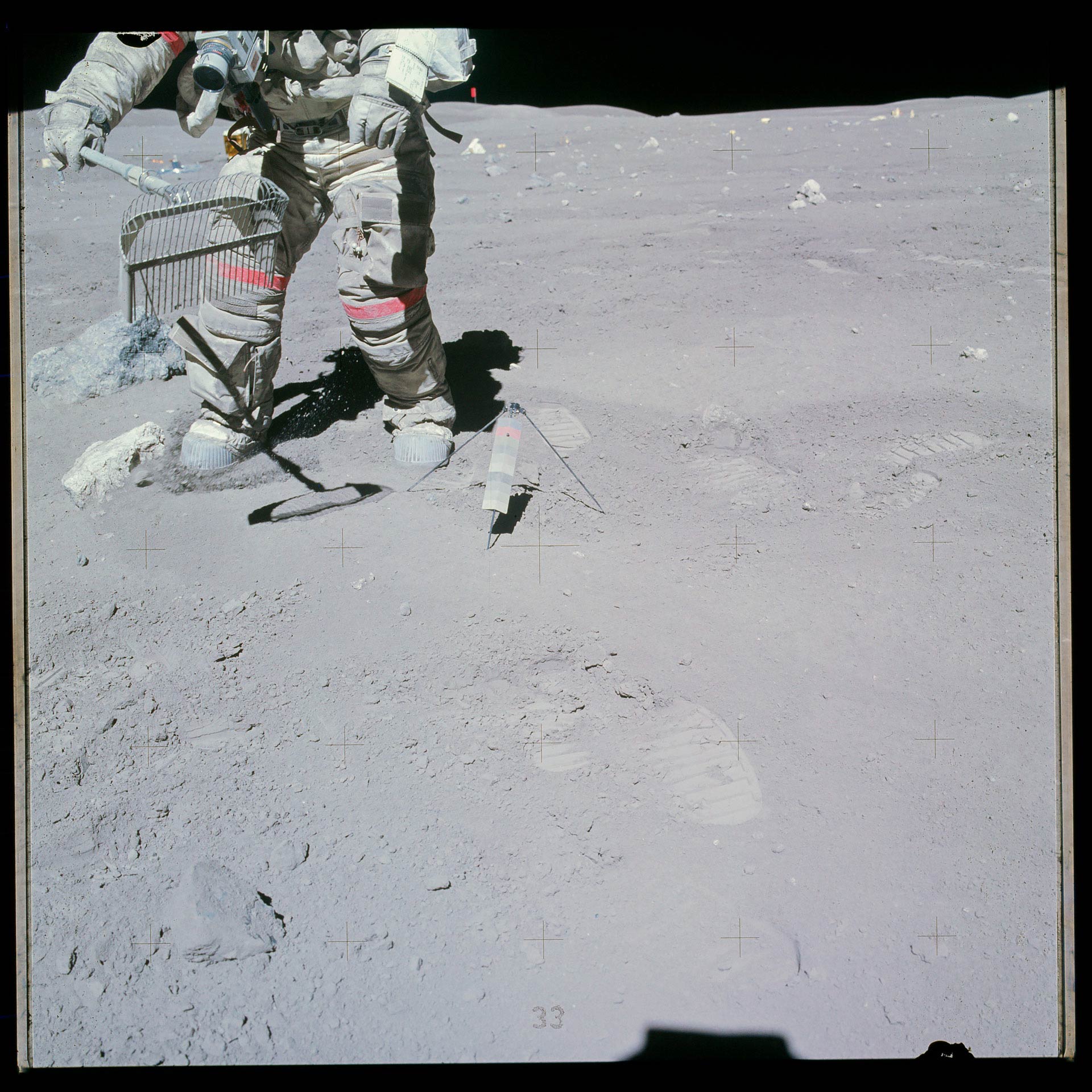
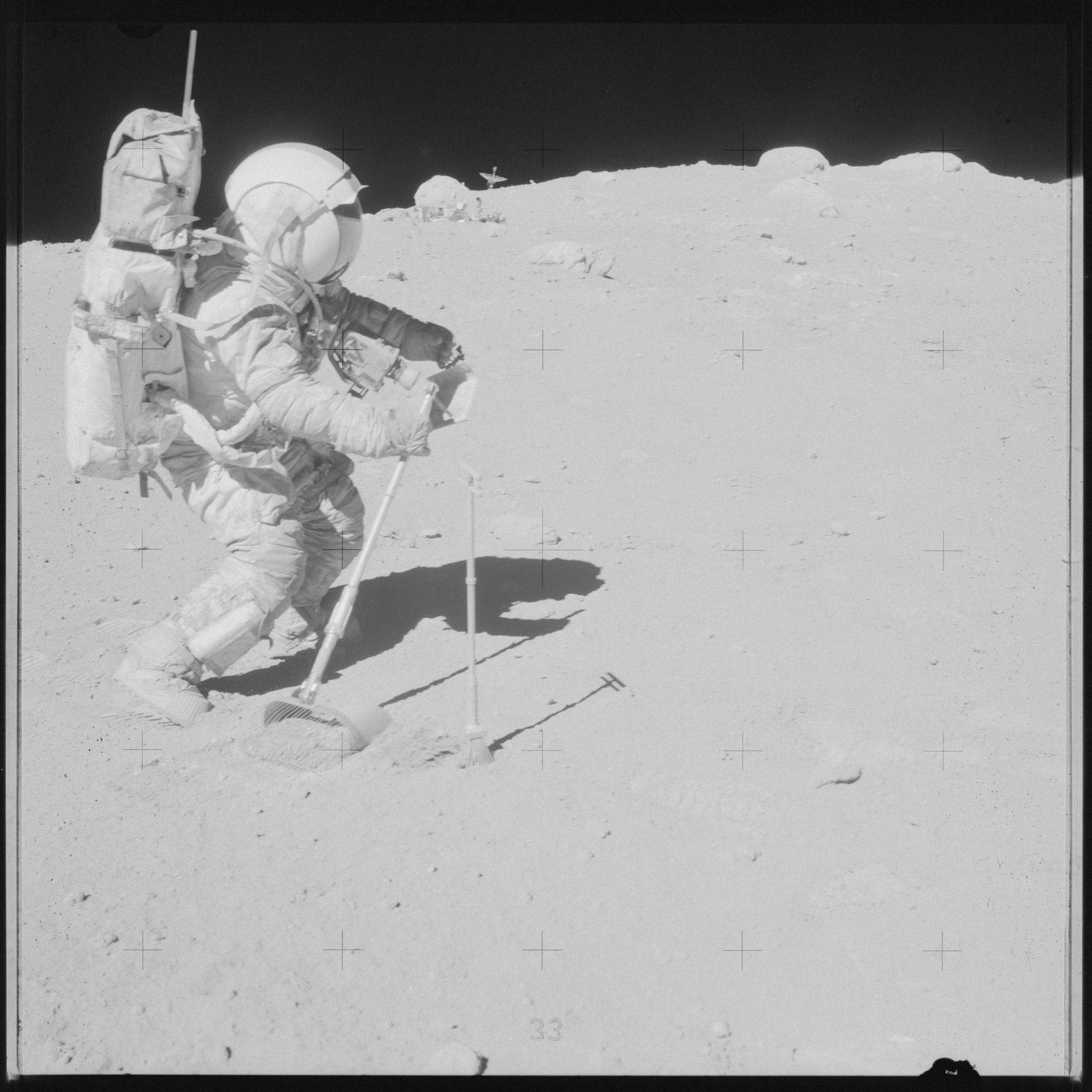
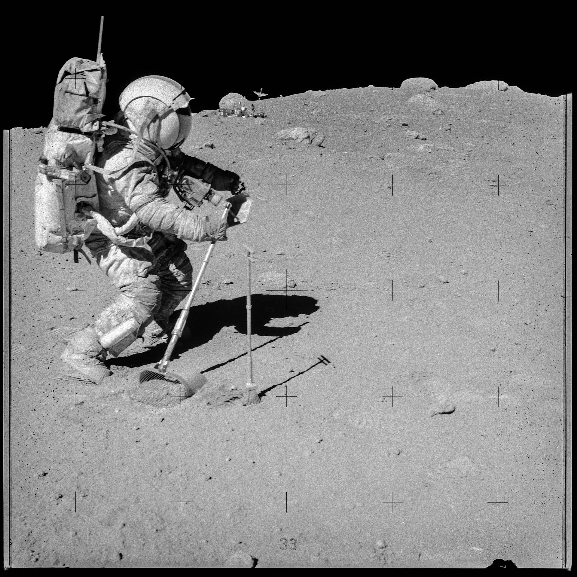
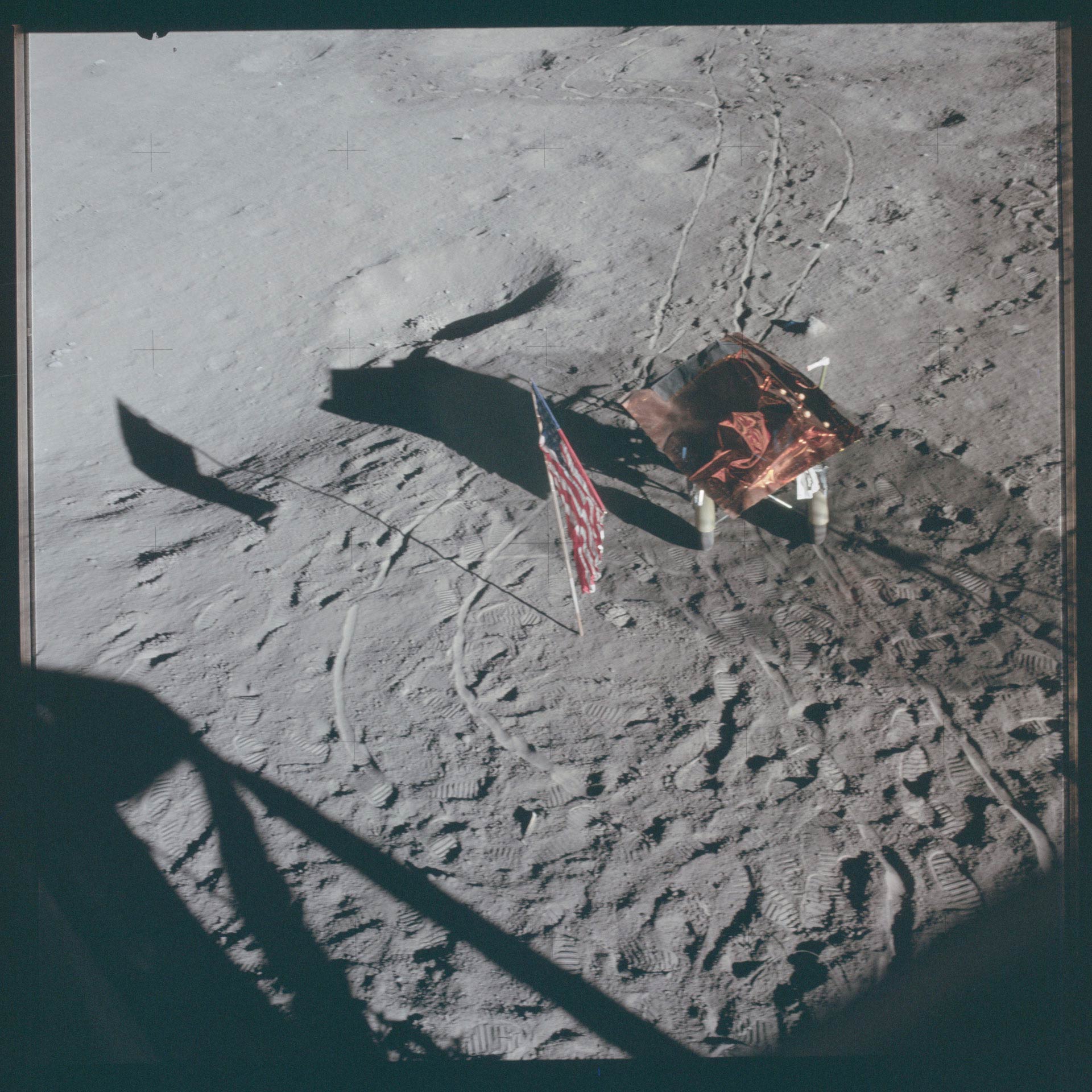
Unfortunately, the scans have not been corrected for color and exposure, so they tend to be flat and tinted. For those of you who like the Instagram-filter look, they’re just fine; it does add a bit of vintage charm. My instinct, though, is to repair them… to try to give them them accurate color and the crispness of a full-tonal range.
For those of you who would also like to indulge your childhood fantasies of visiting outer space, I’ve posted several corrected1 “Corrected” is a term of art, here, since I can only guess at what the original scenes looked like. And I realized too late that some of the rolls of film have color calibration checkers at the end of the gallery. images below. Each image has been combined with it’s uncorrected counterpart, and you can drag the dividing line between them across the image to reveal either the “Before” or “After” image. Just click and drag the circle in the center of the image.
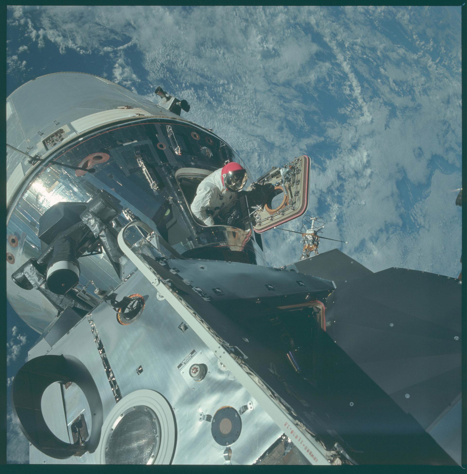
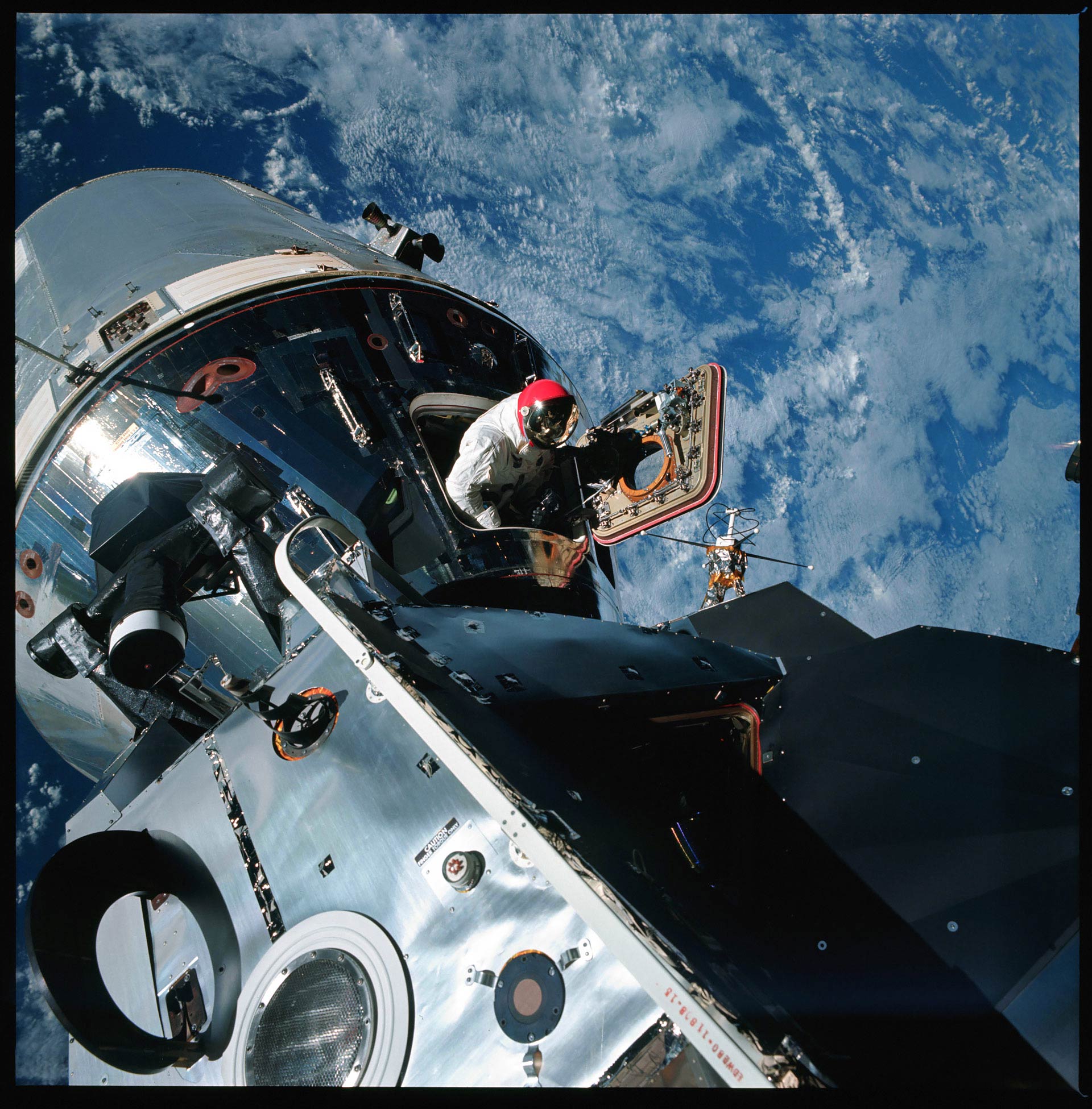
I was unaware that Apollo 9 astronauts had worn red helmets during their EVAs, and I now I want one.
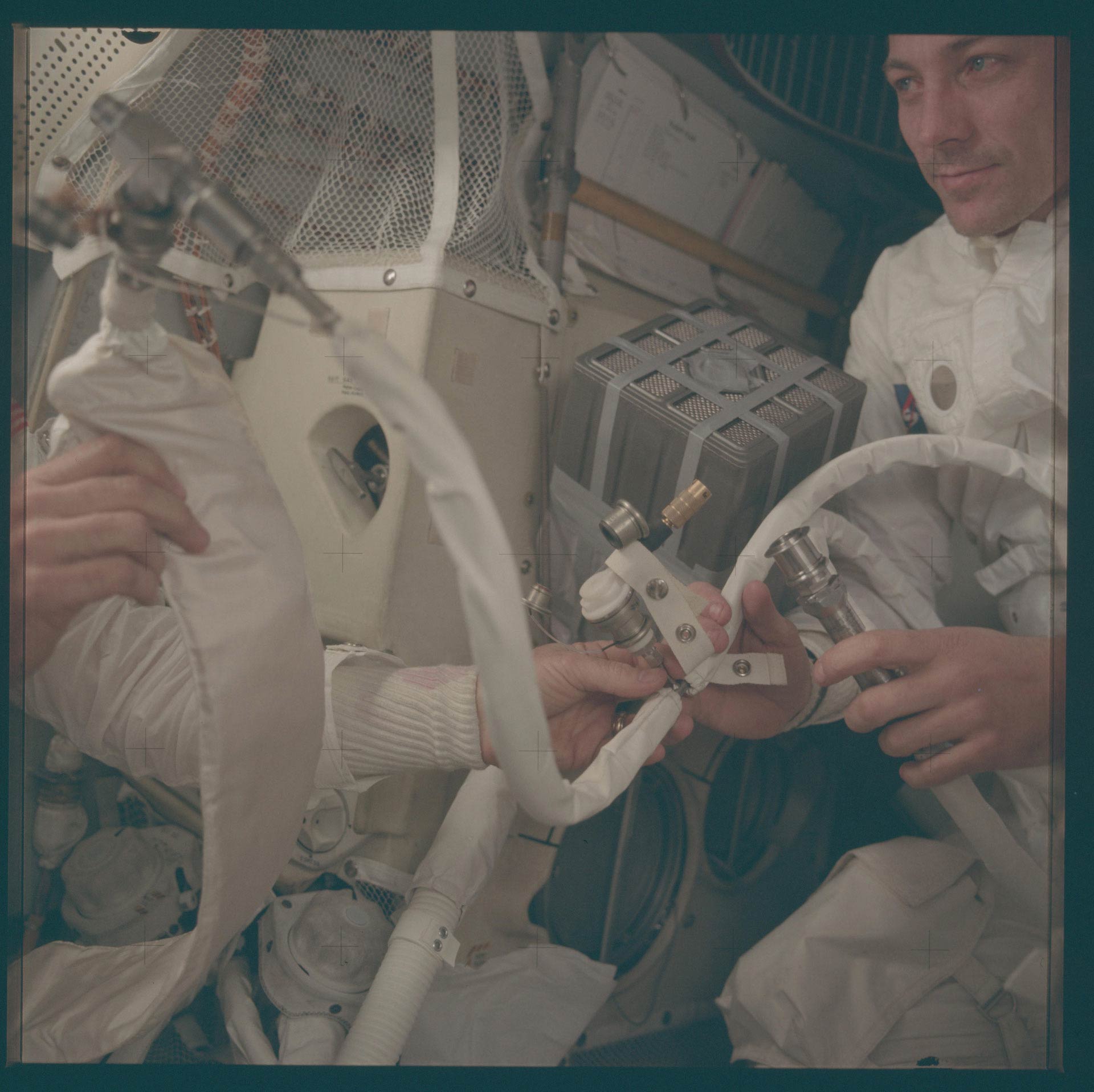
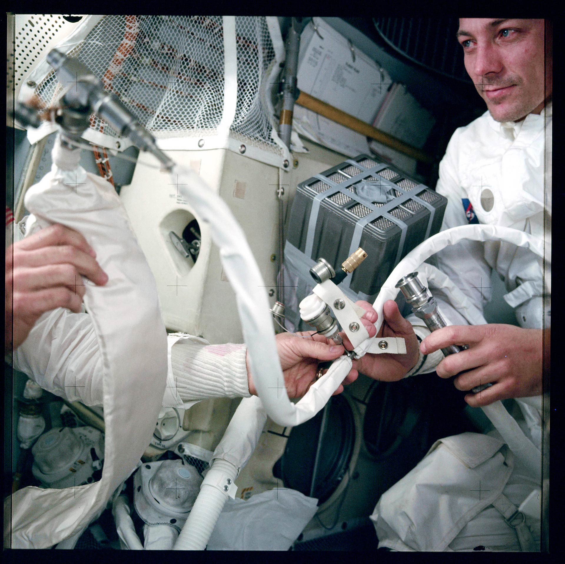
In the photograph below you can see the duct-tape repaired CO2 scrubbers that were made famous by Tom Hanks and company in the 1995 Ron Howard movie. Except these ones are real.
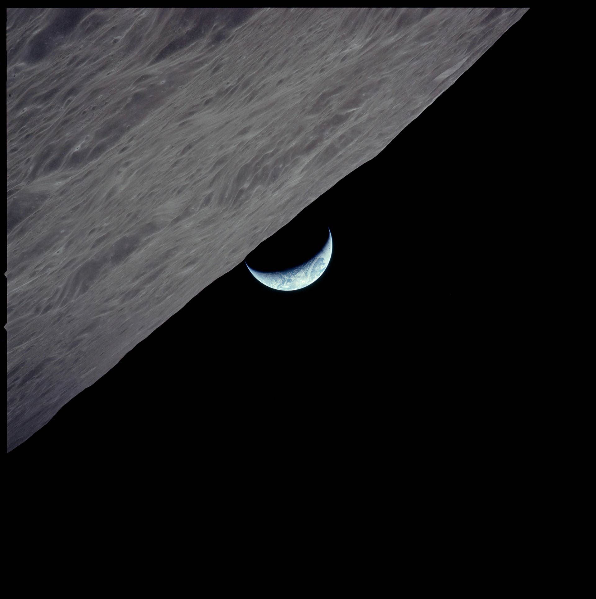
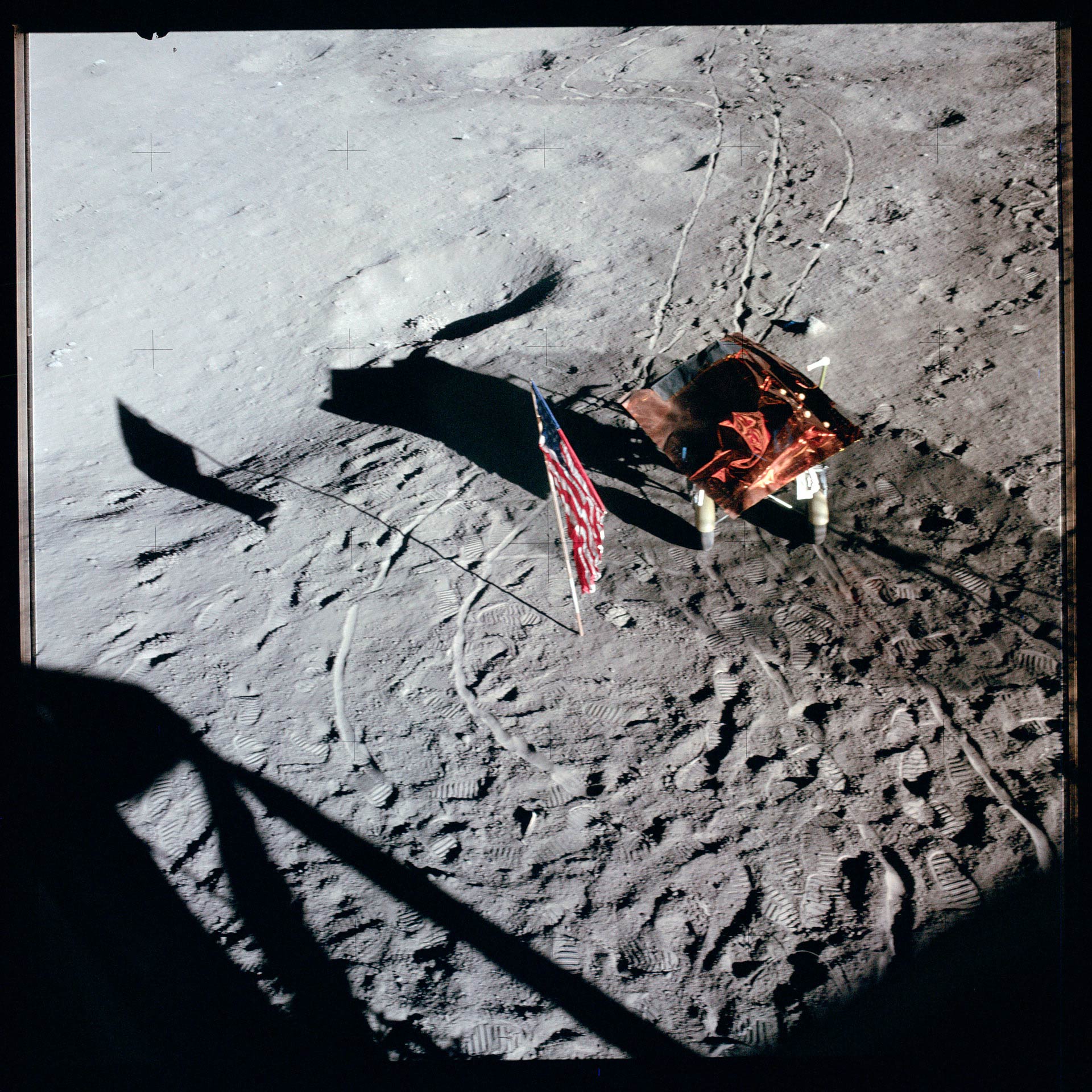
In this case, a little adjustment in contrast helps define the texture of the moon, and of course, the color has been corrected.
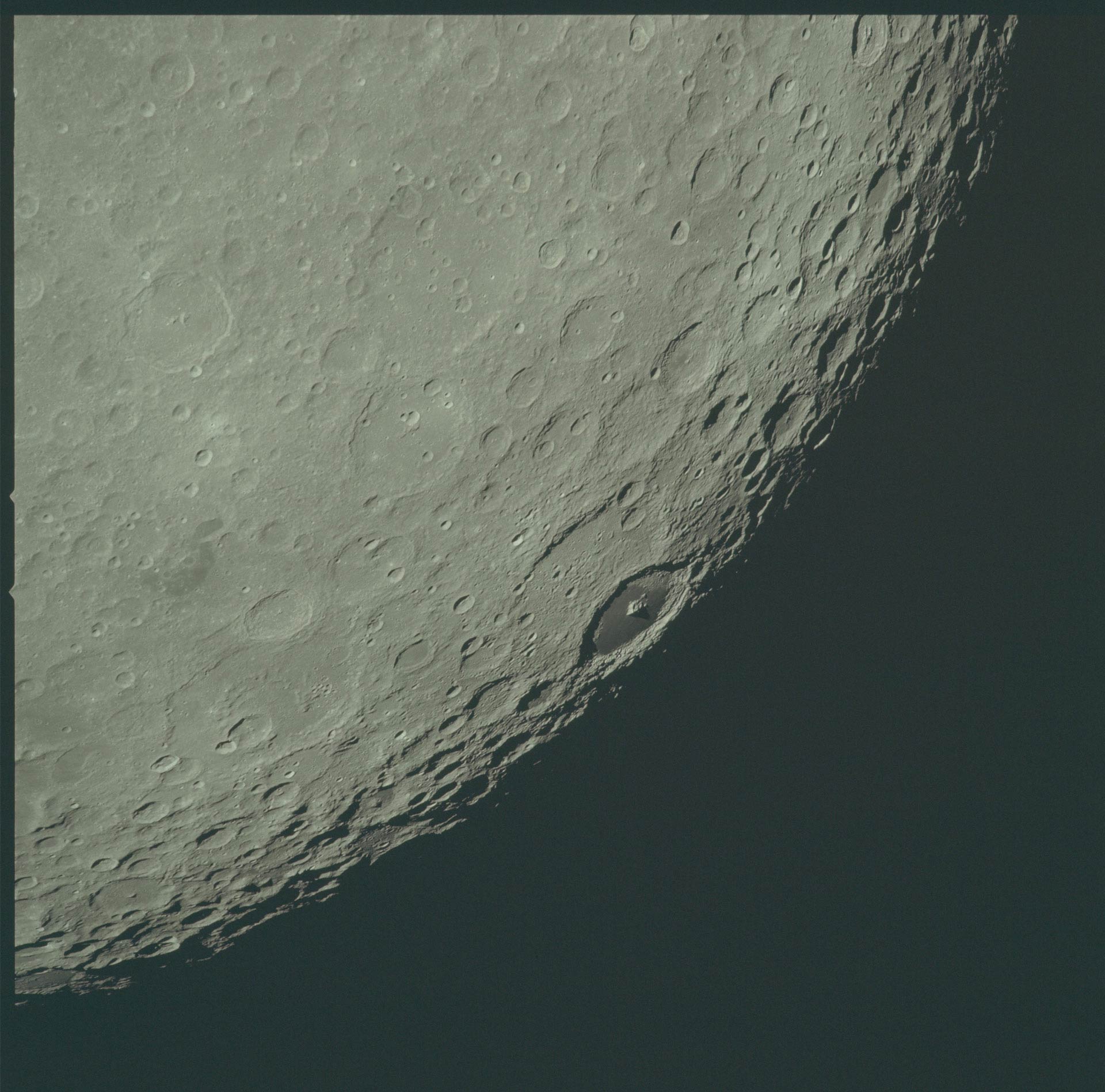
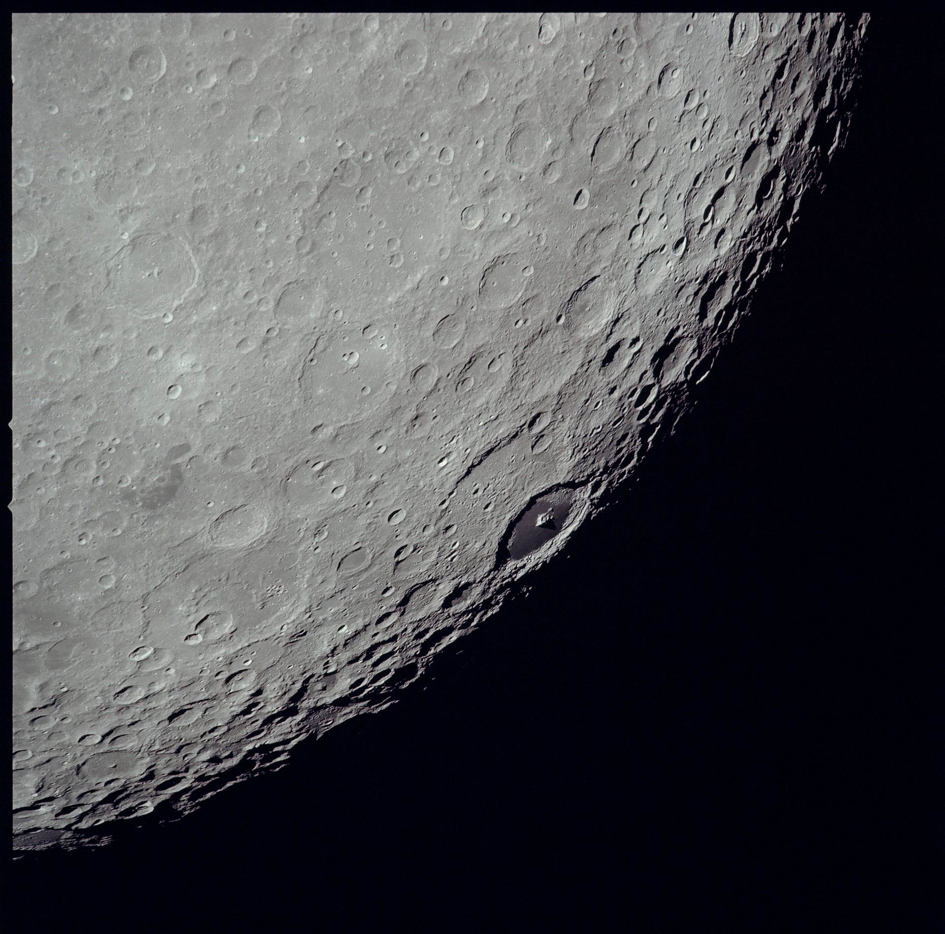
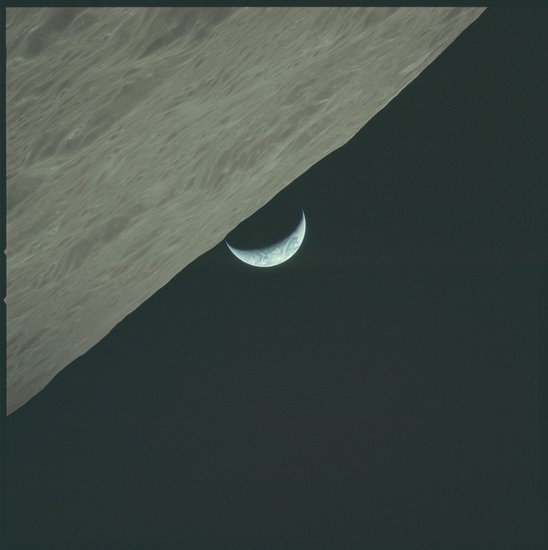
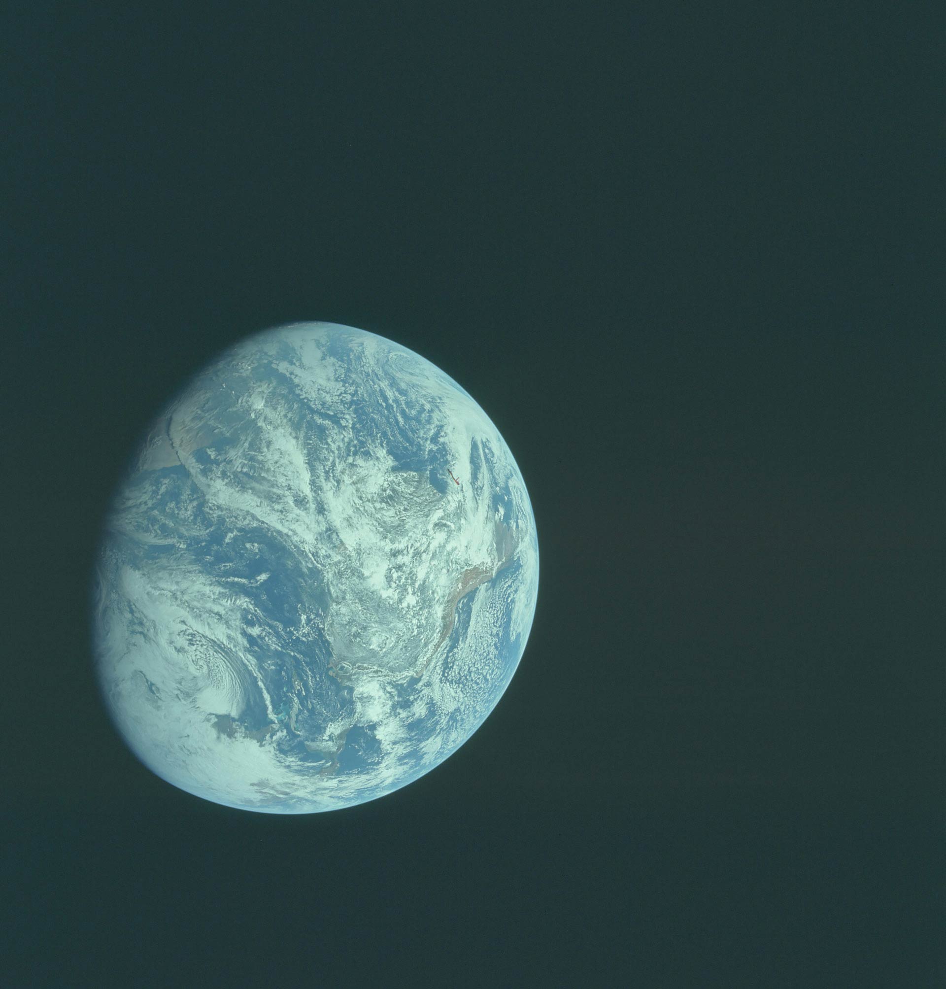
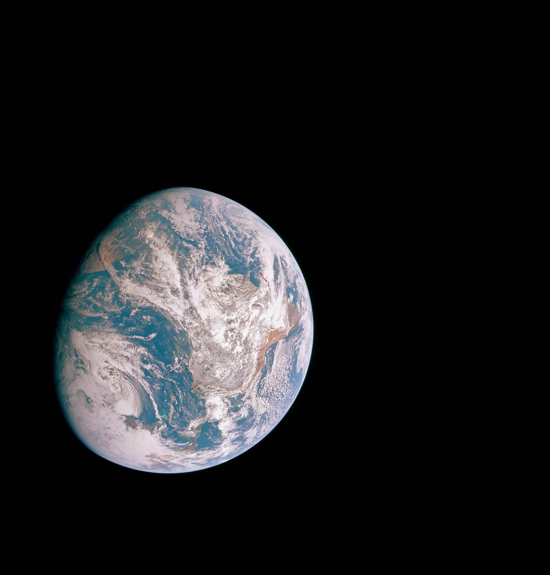
Some scans are in reasonably good shape already, and require only minor adjustments.
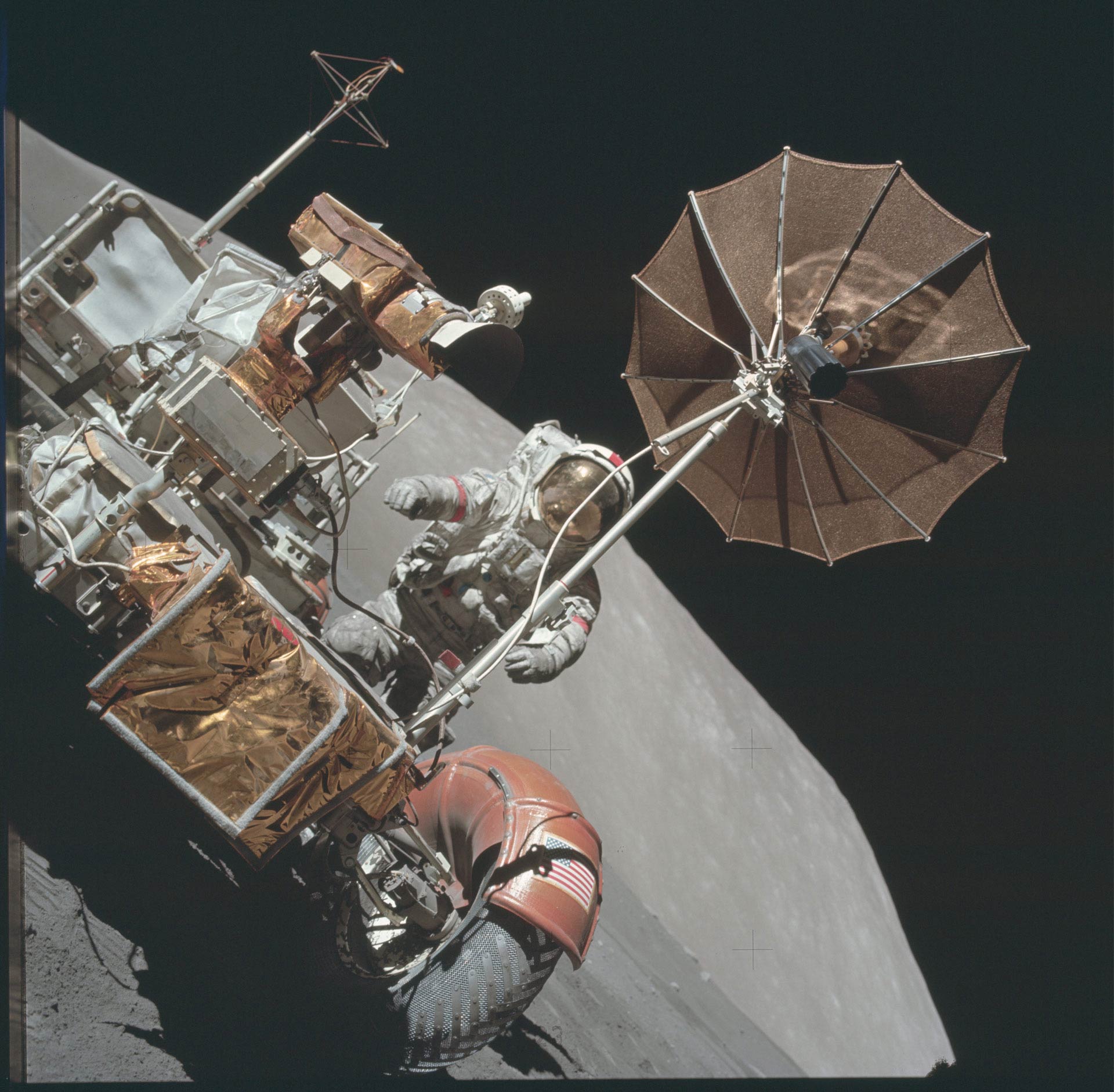
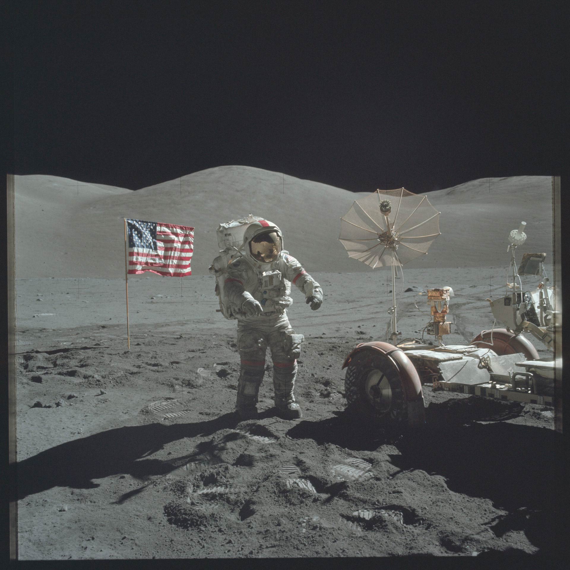
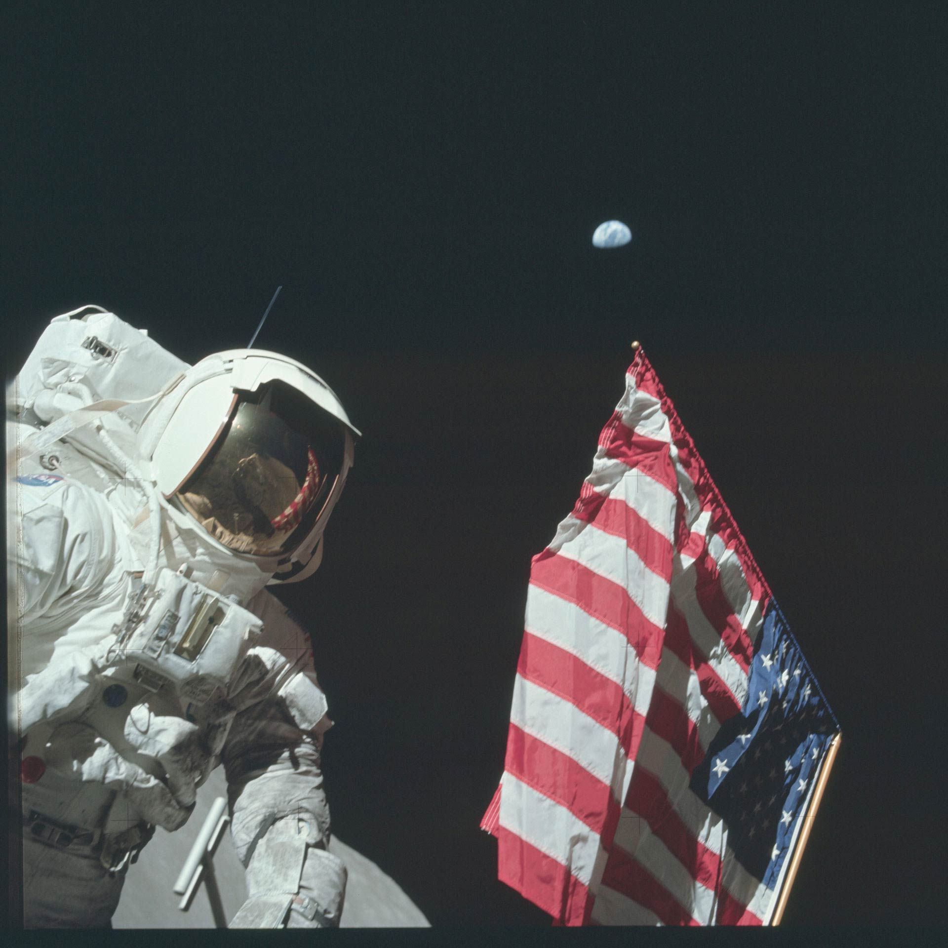
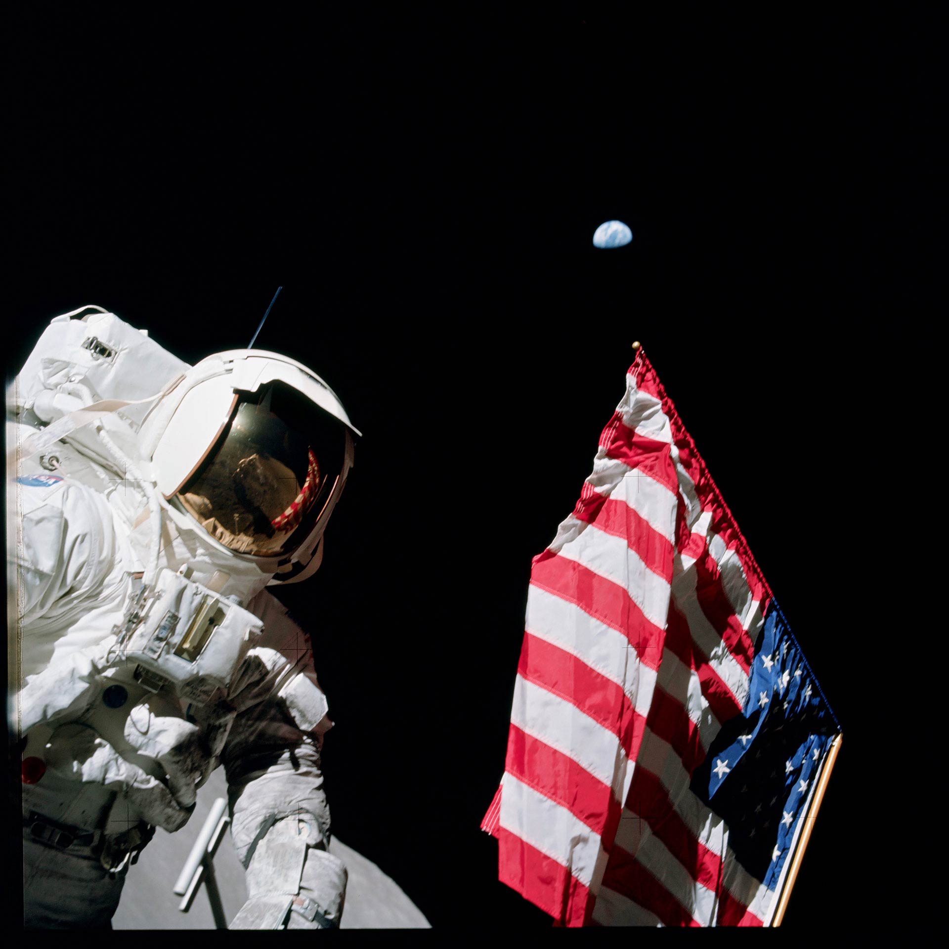
The American flag with the Earth hovering in an inky sky! Someone was trying to send a message to the Soviets.
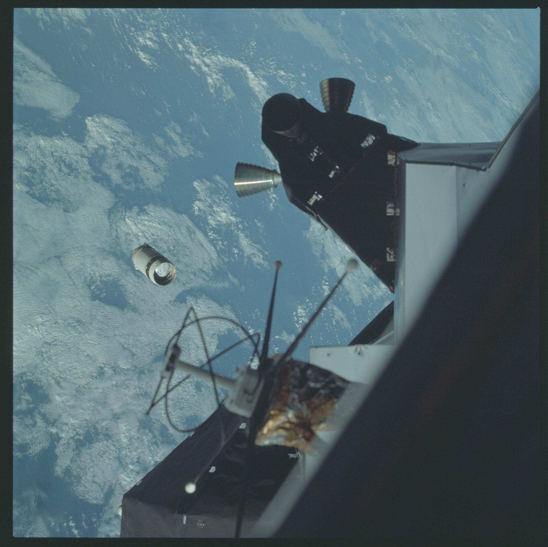
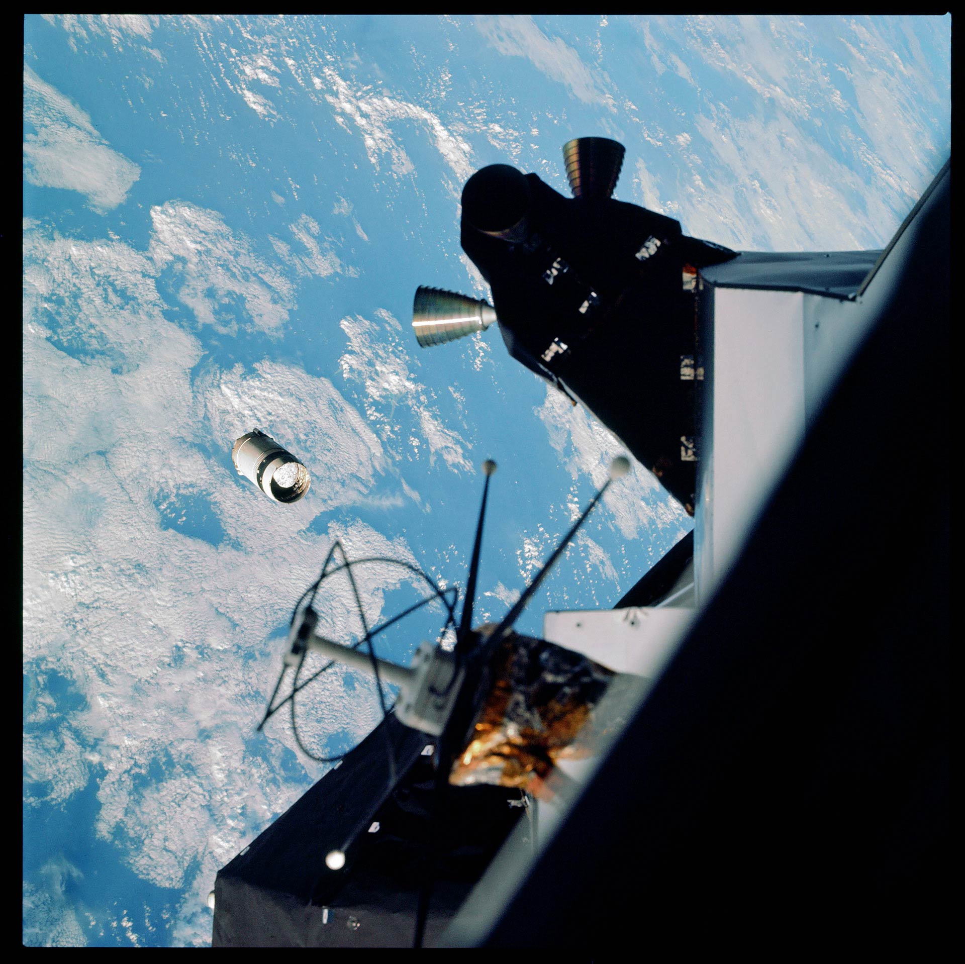
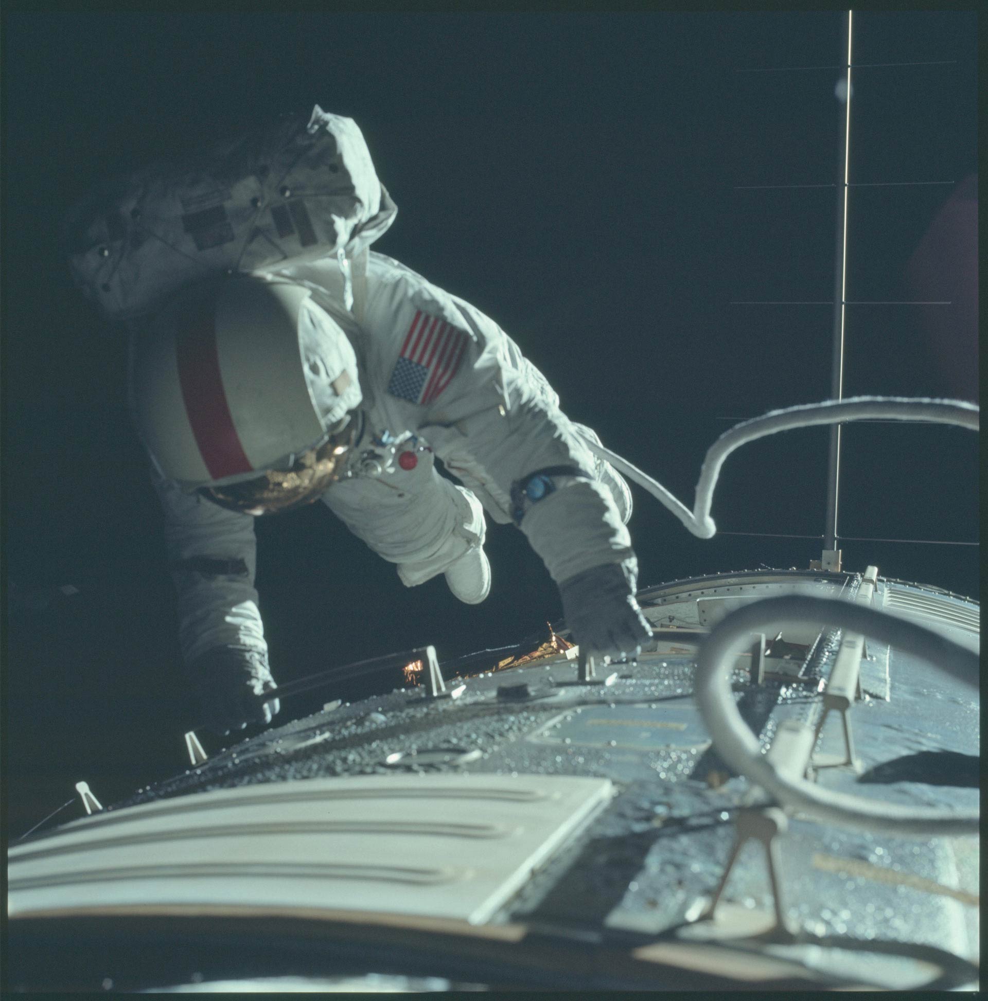
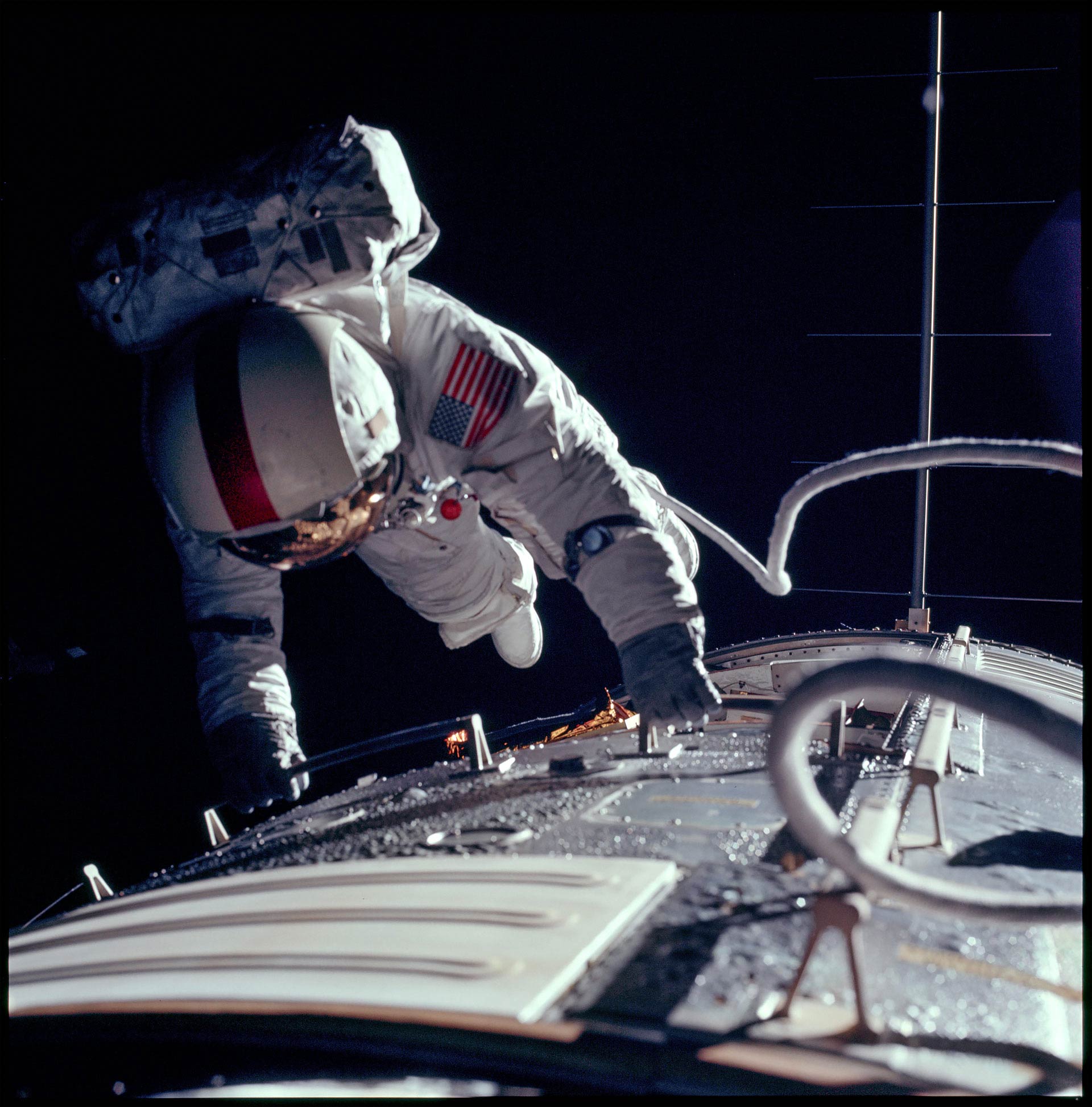
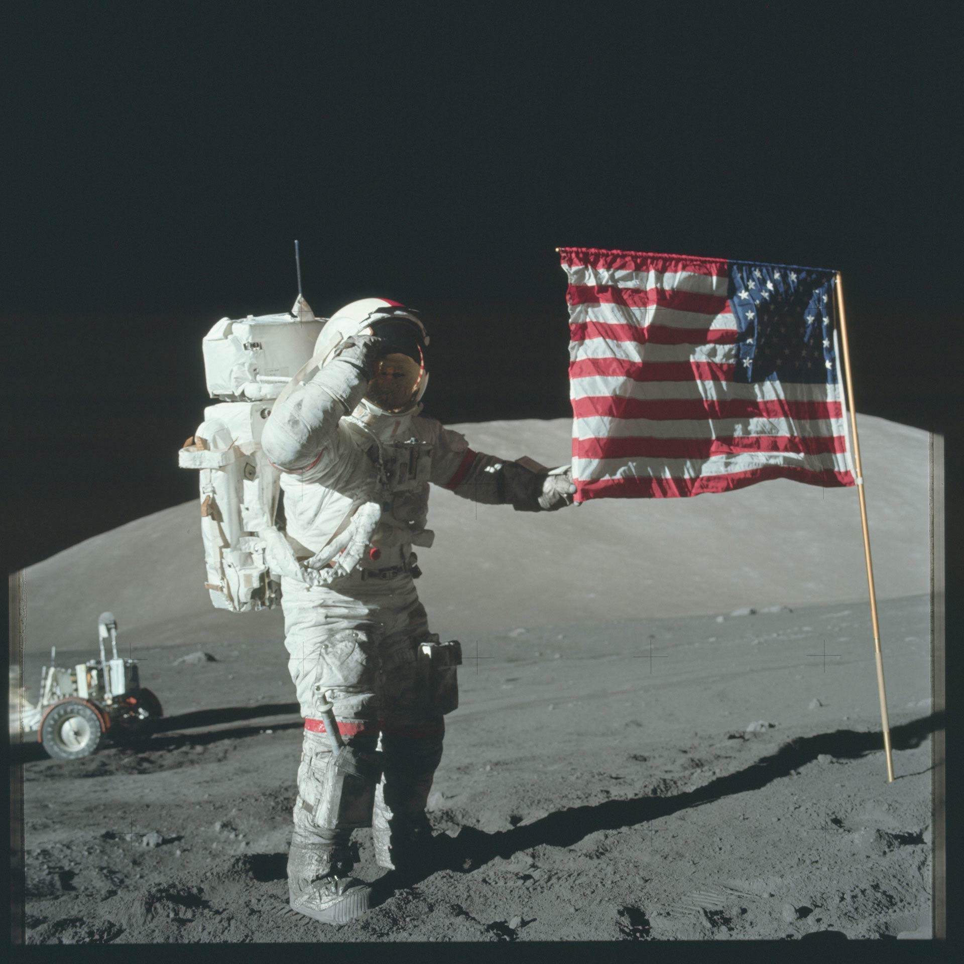
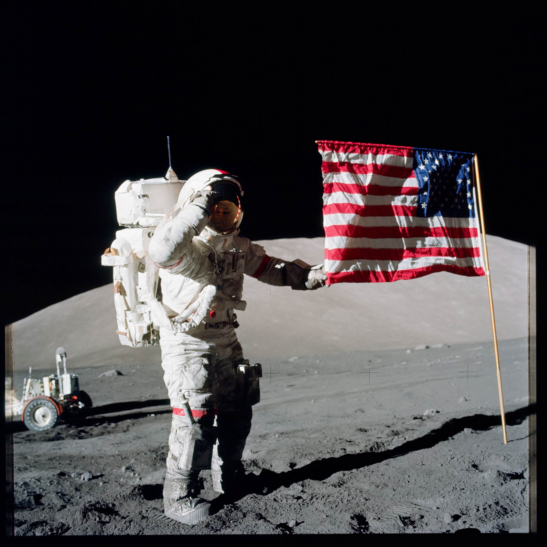
Looking through the whole archive of images, it is clear that some photographers were better than others, and that some were pretty lousy. This really isn’t the sort of thing that should be left to amateurs. I hereby officially volunteer my services as a photographer for any future missions to the moon, Mars, or beyond.
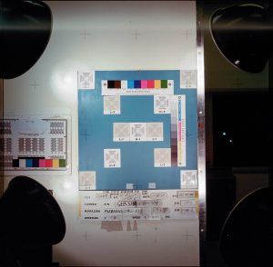
Note: While color calibration charts like the one above can be useful for some purposes, it’s important to keep in mind that what they do is to “standardize” rather than “correct” the colors in an image. To understand the difference, consider this situation: suppose that you’re standing in an open field at the end of a hazy, warm summer day, and the sunlight has drenched everything with a soft, golden glow as it begins to set. If you’re holding a color calibration chart like this one while being photographed, then in post processing, the white squares (and all of the grey squares) will have a warm, yellow-orange tint. If the image is corrected to make the white square pure white, it has been “standardized”: the whites look white, the reds look red, etc. However, the warm, golden hues will be sucked out of the image, and it will no longer accurately capture the scene as it was shot.

