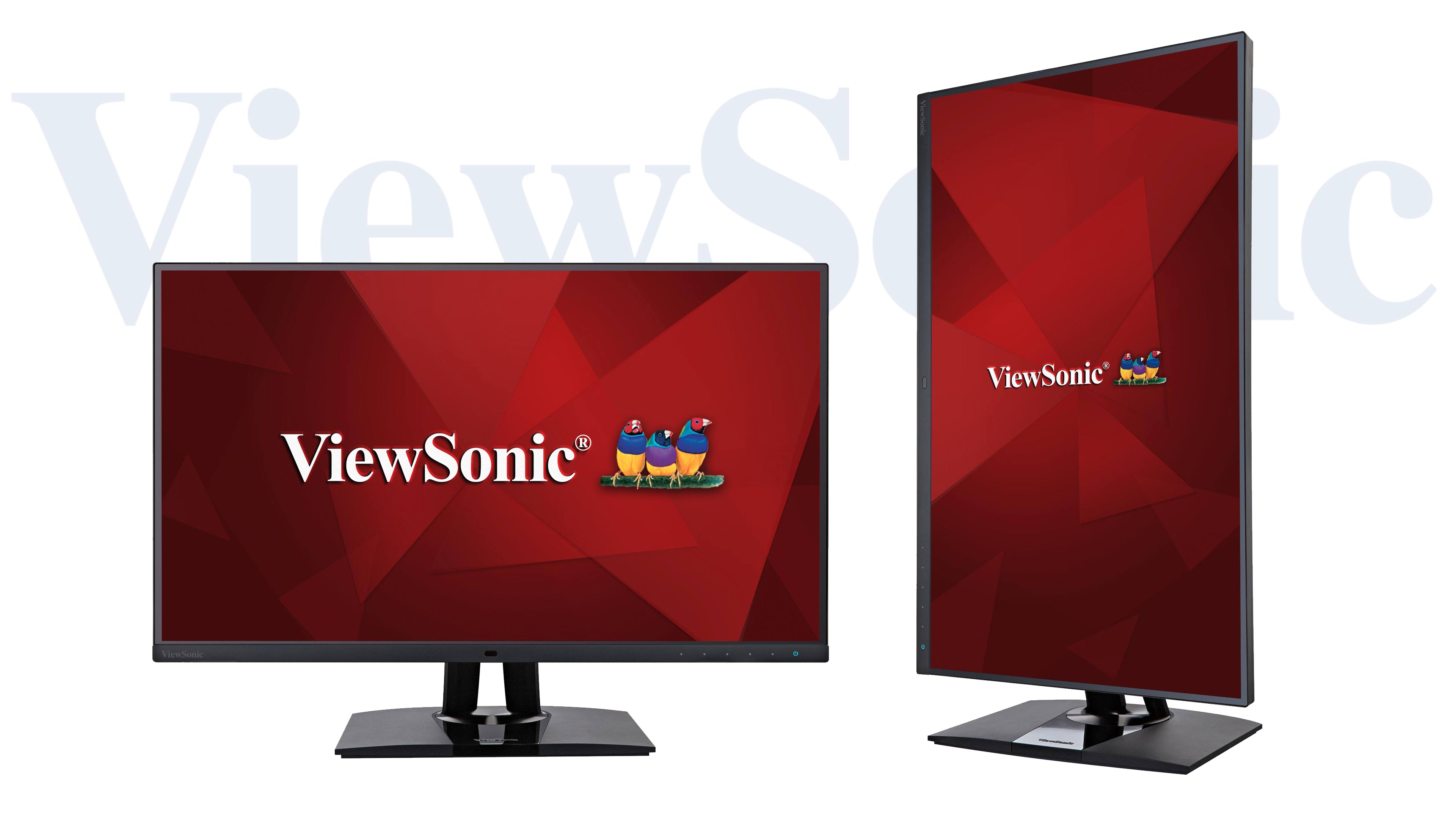
ViewSonic has long been a respected name in the monitor market (I owned a pair of their CRT monitors over a decade ago), but they’ve been best known for their general-purpose and office monitors. This year at WPPI, though, I ran across the ViewSonic exhibit and had a chance to see their line of wide-gamut and web-gamut monitors for photographers, and they looked like they were worth some serious attention. To begin, ViewSonic sent me their wide-gamut model to check out. After several months of use, this is what I’ve found.
But first, the Quick Feature List:
- Less than $899 (currently $699.99 at Amazon)
- 4K resolution (3840 x 2160)
- HDR, 10-bit color, AdobeRGB gamut
- Ambient light sensor
- Cross-screen color consistency system
- USB-C, Display Port, Mini Display Port, HDMI
- 3x USB 3.1 (A-type) Ports
- Adjustable height, vertical rotation, VESA Mount (100 x 100mm)
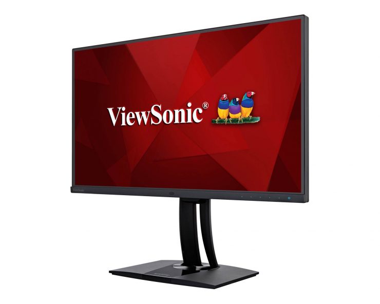
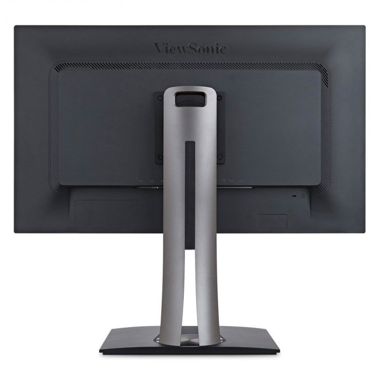
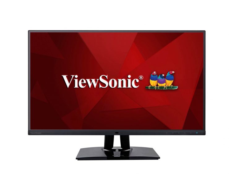
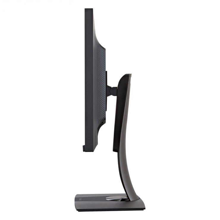
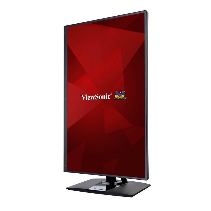
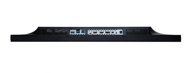
The Screen: Backlight & Color
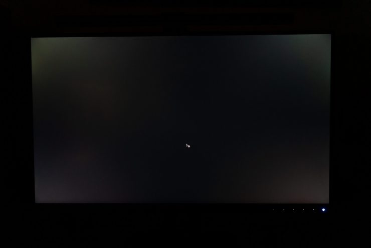
The image quality produced by a monitor is really the most important aspect for photographers, and the Viewsonic VP2785 does not disappoint. There is no backlight bleed around the bezel when viewing a dark screen at typical brightness levels; the panel gives us nicely even brightness from edge to edge… with one caveat that I’ll mention in a moment.
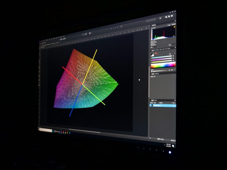
Note that the top of the screen is slightly brighter when viewed at an angle.
I was pleased to find that the monitor’s color looked excellent right out of the box, but I went ahead and used my colorimeter to profile it anyway, which resulted only in a negligible shift in the highlight reds. I switched the monitor to sRGB mode and used it next to a recently calibrated BenQ Designer (sRGB), and there was no noticeable difference in color.
For most of the past few months, though, I’ve used the monitor in its wide-gamut, AdobeRGB mode. If you’ve read my previous reviews of various different BenQ monitors, you’ll know that I love using wide-gamut monitors to view my images, even when there’s no practical need.
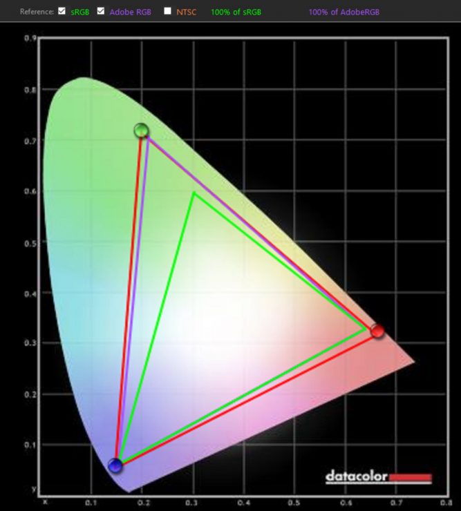
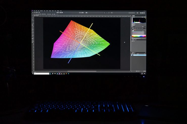
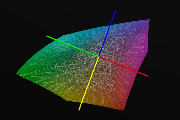
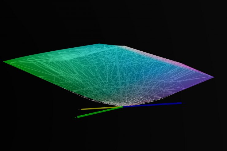
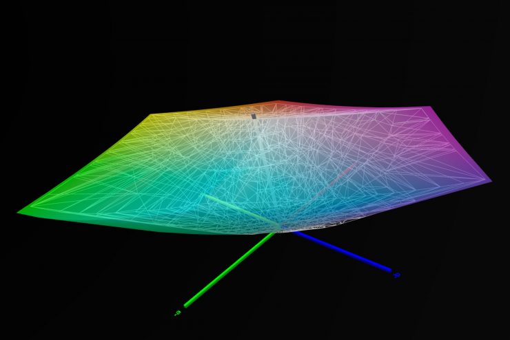
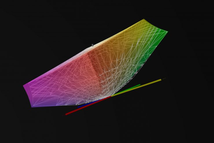
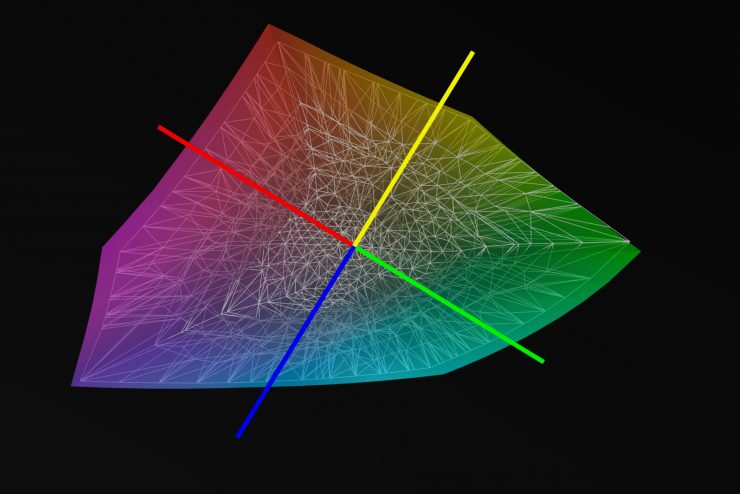
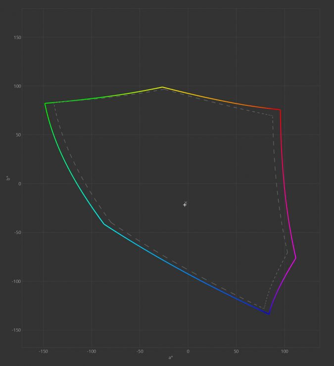
Tests with a colorimeter showed the ViewSonic monitor to be as good as expected, or better. In a quick test with the Datacolor software1 The monitor was set to custom mode, including gamma 2.2 and the brightness adjusted down to 26 to match my room light., results showed better than 100% coverage of the AdobeRGB color space (with a significantly larger range in the greens and blues). A more thorough (two hour) test with DisplayCal showed that only 99% of the AdobeRGB color space was covered, but that the Viewsonic also covered an additional 8% beyond AdobeRGB into larger gamuts. Delta-E (also written ΔE, a measure of accuracy) was below 1.5 for each channel, and 1.24 on average2A Delta-E of 2 is the smallest difference detectable by the human eye, so lower numbers are better. Many standard monitors have a ΔE above 6..
In the figures below, the dotted line and the grey splines represent the AdobeRGB color space, and the colored area represents the area covered by the ViewSonic monitor. AdobeRGB exceeds the monitor primarily in the yellow-green region.
The ViewSonic VP2785 gave me all of the colors that I enjoy, with rich reds and vibrant greens and blues, and the accuracy to produce the subtleties in shading the lesser monitors conflate into a blocked-up mess.
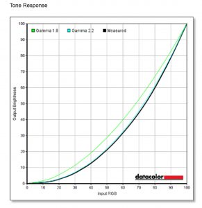
Similarly, the gamma of 2.2 was spot on, the grey ramp looked good, and the tested contrast ratios were excellent, peaking at 750:1 at 50% brightness, and only dipping to 700:1 at lower brightness settings3This is lower than the reported 1000:1 contrast ratio for the monitor, but I did have the contrast settings set to 50% on the monitor, which may have made a difference. Combined with the 10-bit tonal depth, this makes the monitor wonderful for editing black and white images.

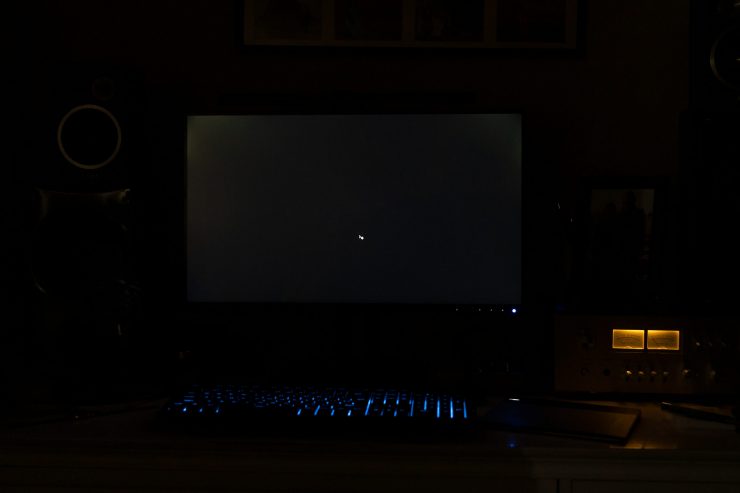
And now to that caveat. The screen brightness is very even when your view is perpendicular to the surface. However, when viewed from an angle, there’s a significant amount of brightening when the screen is dark, particularly across the top and bottom of the screen.
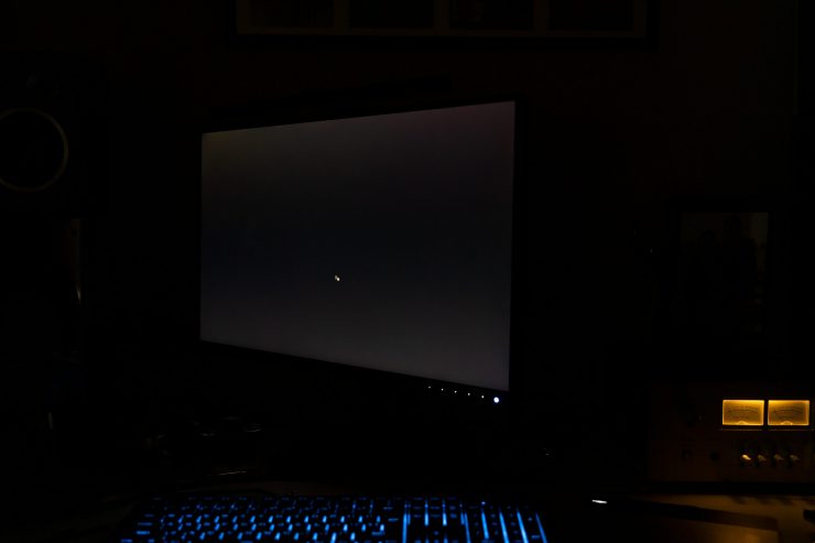
And unfortunately, if you’re sitting about two feet away from the monitor, the angle to the corners of the monitor is great enough that they sometimes appear brighter than they should. I don’t notice it during real-world use, but under the right conditions, it’s visible when you look for it.
Monitor Design & Features
Beyond the picture quality, the monitor looks good but utilitarian: perfect for a professional setting. The bezel around the screen is just a thin (~1mm) line, with a 1.5cm panel along the bottom to frame the control buttons and ambient light sensor.
My office has very consistent light levels, so I didn’t test the monitor’s automatic brightness adjustment, which is intended to make editing more comfortable as light levels change throughout the day (as we’re all familiar with from our phones). I prefer to set a single level and get used to it.
The monitor has a “color uniformity” feature that is intended to keep colors consistent across the screen, but it is not available in AdobeRGB mode, which was where I tested the monitor, primarily.
What’s Missing: Beyond the high-quality display, ViewSonic’s feature list is a bit Spartan. Though there are a few spare USB ports if you need them, there are no incorporated card readers, which are not much of a loss. There is no external quick mode-change puck, as we’d find on BenQ models, which I also don’t miss.
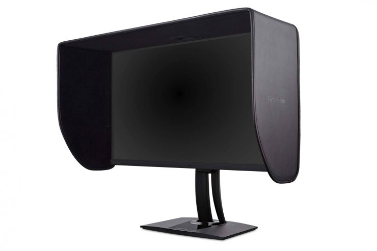
However, I do miss having a matching, dedicated monitor hood. The ViewSonic does not ship with one, and it does not have mounting slots for one to attach. When I first saw this range of monitors at WPPI, they were outfitted with soft-material hoods (Viewsonic MH27M1) that were attached with Velcro. These will add an additional $59.99 to the cost of your monitor, and they look like after-market add-ons instead of an integrated design.
Problems & Concerns
As mentioned above, the loss of contrast when viewed at an angle has the potential to be problematic, since the corners of the monitor are always viewed at an angle when you’re centered in front of it. This is, however, a negligible issue for practical purposes.
Otherwise, my only concern with this monitor was the capacitive (touch) power switch and menu buttons. For a period of about a month while I was using the monitor, the power button worked intermittently: I’d touch it to turn the monitor on, and nothing would happen. I’d sit there poking at it for a few minutes… trying the tip of my fingers or the flat of my thumb trying to get it to turn on, and eventually, it would inexplicably work, and all would be well.
And then, just as inexplicably, I stopped having problems with it. Did I have too many USB devices hooked up to the monitor, and it was a power-draw problem? Was there a cable or something touching the area of the monitor that I didn’t notice? I don’t know. But as cool as a capacitive button is, I’d prefer the reliability of a standard mechanical switch.
Value & Alternatives
At $699.99, the VP2785-4K may be the least expensive AdobeRGB monitor of its size and resolution on the market, and the monitor’s color is excellent for real-world use, making this a great deal if you don’t need too many extra bells and whistles.
The ViewSonic’s size and feature set make it an obvious competitor to the BenQ SW271, which sells for about $1099 at B&H or Amazon. Though it’s more expensive, the BenQ does come with some extras and it uses a true 10-bit panel, while the ViewSonic’s display achieves 10-bits through FRC4Frame Rate Changing is a method of producing the perception of additional colors by rapidly flickering between two neighboring colors. with its 8-bit panel (though there’s little practical difference). For what it’s worth, the BenQ uses about 20% less power than the Viewsonic, on average.
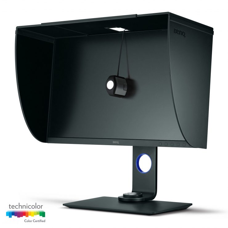
Dell and Acer both make 27″ 4K wide gamut monitors, but they cost about $1600 and $1300, respectively.
An option that may appeal to some photographers as an alternative to the ViewSonic is the Asus PA329Q, which is a larger 32″ 4K monitor with reported 99.5% AdobeRGB coverage, and a price of $1099 at B&H or Amazon.
Conclusion
Ultimately, the ViewSonic VP2785-4K is an excellent monitor, especially considering that it has the lowest price in its class. The minor brightness uniformity issues with the panel that I noted are not a problem for practical use, and the color is both beautiful and accurate.
