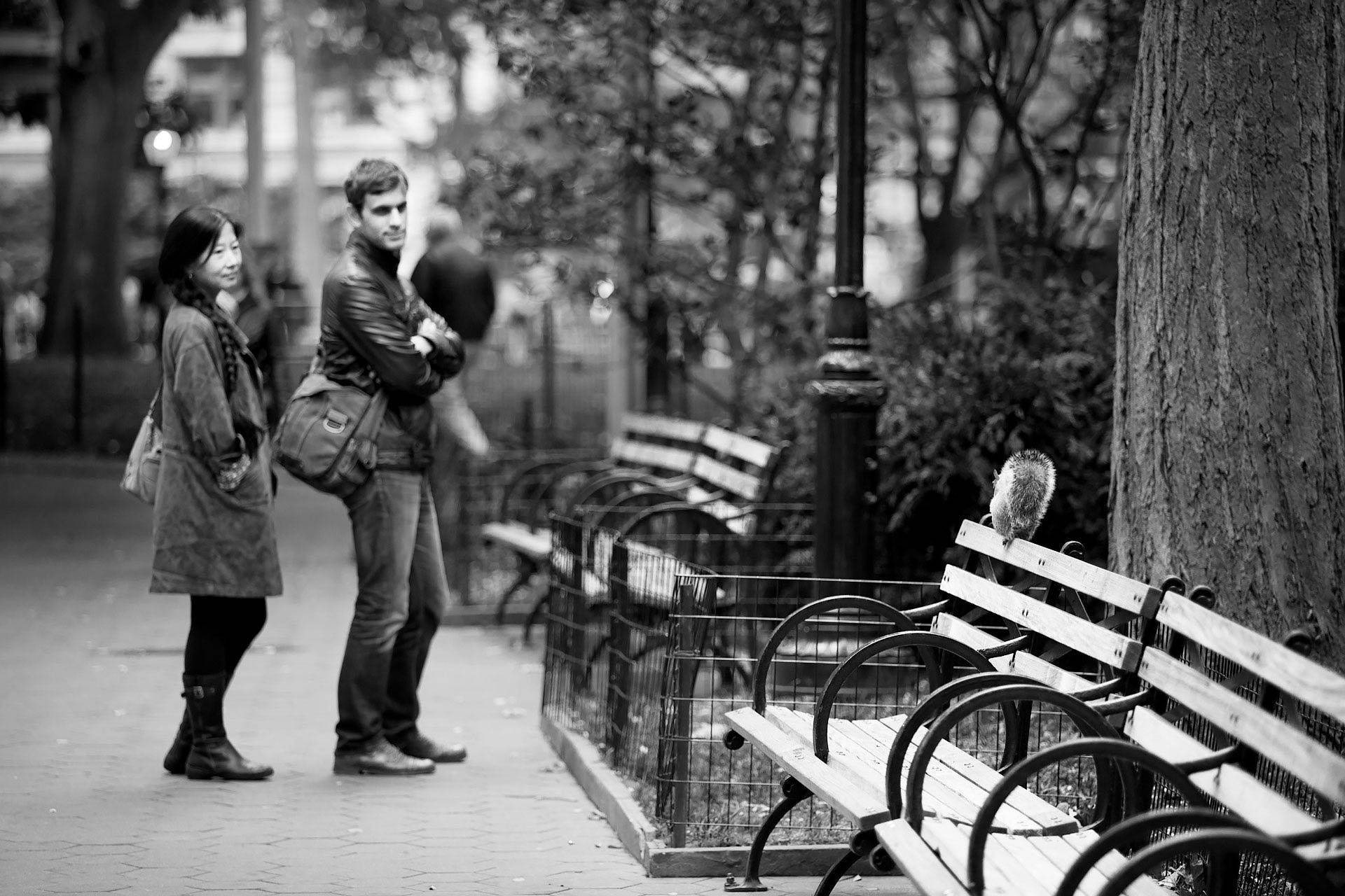
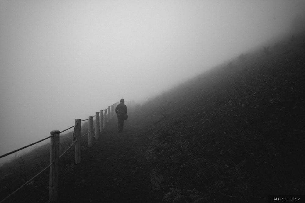
Leading lines are composition elements that allow a photographer to direct the viewer’s attention in the photograph, making the image simpler for the viewer to “read” and keeping their eyes from wandering out of the image. We’ve already discussed one type of leading lines in the section on the Vanishing Point perspective, but this is a complex topic that deserves to be revisited. This won’t be the last time.
Leading lines can be broadly categorized into two groups: lines that lead your attention to the subject, and lines that lead the eye on a visual path through the image.
Lines Leading to the Subject
In a complex image, it is often helpful to have leading lines pointing at the subject in the image. Not only will it cut through the chaos of the image and help the viewer understand what the subject is, it will keep the viewer’s eye in the picture and keep it from wandering out and moving on to another image or subject.
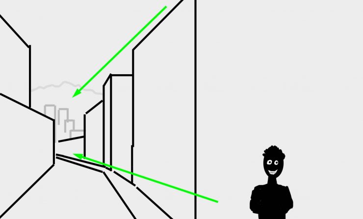
It’s equally important to recognize when strong lines exist in an image and they pull the viewer’s eyes away from the subject and out of an image. Consider these sketches:
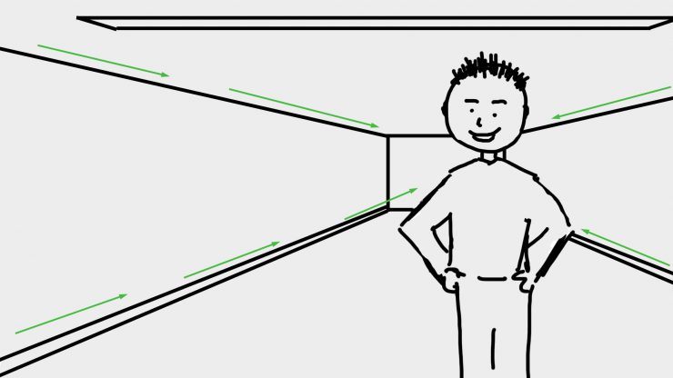
Above, the strong diagonal lines of a room/hallway lead to the subject, drawing the eye in. But the lines don’t have to be converging perspective lines, they can be any strong lines that lead toward the subject, like these:

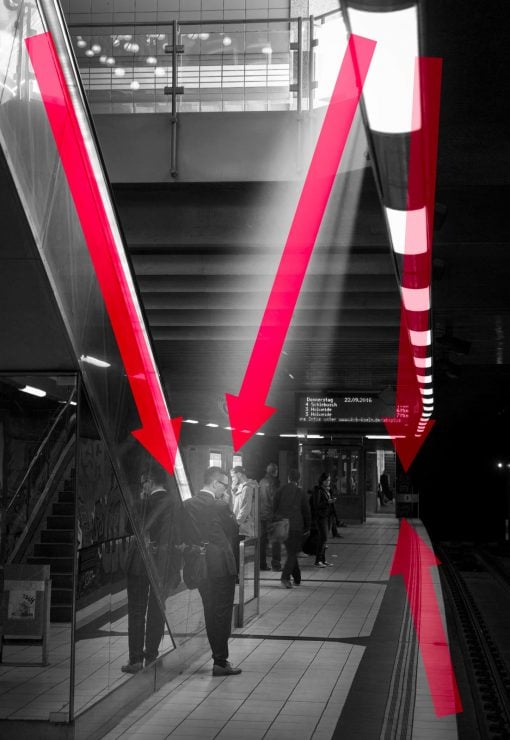
The lines created by the escalator on the left and sun from the right lead straight down to the subject of the images. The lines formed by the row of lights and the platform edge on the far right were dangerously close to leading out of the image, and I had to move as far to the right as I could to get the lines pointing back into the image a bit.
Below, on the other hand, the same type of lines pull the eye out of the left side of the picture, away from the subject and ultimately out of the image. Positioning the subject on the other side of the street and re-framing a bit to the left, would lead the viewer to the subject instead.
Similarly, in the image below, the lines of the bridge lead the eye back towards the cathedral and the bright sky behind it. The subject of the image, though, is the climber in the bottom right, and she almost gets lost. If I had used a flash to make her brighter, then she could have competed with the cathedral as the subject of the image, and the lines in the bridge would have simply served to connect them. Instead, they distract.

That doesn’t mean that you can’t or shouldn’t frame your images like the ones above… it only means that you should understand how most people are going to read it. How you use these tools is up to you. I’ve added a few more examples below.
Lines Leading Through the Image
In landscape photography it’s often helpful to have a visual path that draws your eye through the image. When you start to look for leading lines, you’ll see them everywhere in good landscape photos, sometimes leading from the foreground to the background, sometimes leading in a longer path across the frame, other times in spirals towards a more central area. It doesn’t matter where the lines point, as long as they’re visually strong.
One of Ansel Adams’ most famous photos from the Grand Tetons uses the Snake River for this purpose.

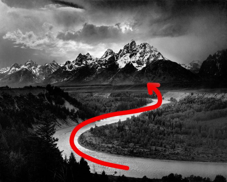
As you can see, the bright river creates a path through the darker foreground for the eye to follow into the center of the image and directs it towards the peaks of the Tetons in the center1 This particular copy of the photograph is poorly processed, unfortunately. When processed by Adams, the central mountains are brighter and cleaner. . Notice that the horizon (top of the mountains) has been placed about 1/3 of the way down from the top of the frame, conforming to the rule of 3rds.

Here are a few photos that I took last month, first in the dunes at Great Sand Dunes National Park, and a few random shots from my drive home.
In the first image, the eye will probably be drawn first to the brightest area of the image in the bottom left corner, but from there, the bright tops of the dunes create a zig-zag path up through the image.


And here’s a more literal example. From the left side of the frame we can follow the tracks of a vehicle down to the cottage, the subject in the lower left of the frame, and from there, there’s a heavier track that runs away from the house to the right, which meets up with a road, which (along with the clean line of the horizon) points to the secondary subject… the mountain in the background right.

In this photo from Dubrovnik, Croatia, the line of the dock leads back to the first subject (the boat), and then the line between the sky and dark edge of the rocks leads the viewer up to the city walls, though the brightness of the sun on the town may get you there first.
As mentioned previously, spirals, curves, and straight lines of all orientations can help direct the viewer’s eyes around the image. Here are a few more examples.


Reading an Image : Direction
In almost all Western nations, we read from left to right and top to bottom. If you’re reading this now, that fact may seem pretty obvious, but what might not be as obvious is that we tend to read images the same way, possibly due to those habits formed by reading text 2 Though some Asian and Middle-Eastern languages are read from right to left, sometimes bottom to top, there is some evidence that they still read images the same way as those of us in the West . And just as we follow lines of text across a page, our eyes will tend to follow strong graphic lines across an image.
When it comes to reading photographs (or paintings, drawings, and other images), our reading process is not as strict as it is with text. However, as a general rule, our eyes will begin in the upper left (or the left side more generally) of an image and start scanning around the image from there. If a strong line is encountered, the eye will tend to follow that line into the rest of the image. There are some interesting psychological results of these habits, not just in photography but in video and the arts in general. When people move from left to right in an image in a video, for example, it is viewed as more positive than moving right to left, an effect that seems to have been understood by Alfred Hitchcock. See this video for more information.
But let’s not make too much of this left-to-right habit; images can work with strong lines moving in any direction. The important point is that people’s eyes follow strong lines (lines contrasting in brightness or color) through an image, and we can use that fact regardless of direction.
Examples?
Again, rather than filling this gallery with my own images, I’d like to see some of yours! They don’t need to be artistically or technically perfect… simply email me your photo (any size) that is a clear example of Leading Lines, and I’ll add it to a gallery below. Please also include how you’d like your name to appear in the byline, either as your username here, or your real name.
Interested in the rest of the photo composition series? Just follow this link to the index.
Composition SeriesQuestions & Comments
I’m always curious to hear what you think about these articles! If you found this useful or have something to add, please let me know in the comment section below. And of course, I’m always happy to answer questions, as long as I can find some internet access.


