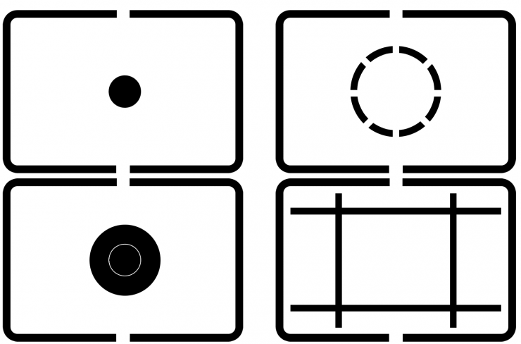
Canon metering-mode icons simply don’t make sense. I’m not a designer -I admit it openly- but it seems clear to me that icons for camera functions should, at the very least, give a strong hint about what the function does, either by representation (the icon looks like the function) or convention. Canon’s metering icons do neither. If that’s not immediately clear, it will be if you consider each metering mode individually.

Spot metering is the easiest place to start, and the only instance where Canon gets it right. What is spot metering? It takes a reading from a small area (ie, a roughly 2-3% spot, usually) in the frame. Looking at the four icons above, which one makes sense for spot metering? C is clearly the best choice; it represents a small spot in the center of the frame.
What about Parial Area metering? Partial metering is just like spot metering, but it includes a slightly larger area, generally the central 5-8%. Which of the icons represents that? It would be reasonable to think that it would look just like the spot metering icon, but with a slightly larger area tacked on, like icon A. But that would be completely wrong. Another option could be icon B, which surrounds a larger area than the spot metering icon, it’s just not filled in. And that’s the correct answer, although two different conventions are used to attempt to convey the same idea (a filled area versus an empty, enclosed area).
Center-weighted metering should be simple to represent: at the very least, the central area of the image should be marked in some way. And since B was already chosen, the answer here must be A, right? Ha! Wrong. Instead, Canon chose D, the icon that shows a completely empty frame. How does this represent that the metering system is most heavily weighting the area in the center of the frame, but also includes the rest of it? It does not.
Finally, we must consider evaluative metering. Evaluative metering does not give preference to tonal values in the center of the frame. Instead, it looks at zones across the entire image area and calculates an exposure value based on their average (or some more complex algorithm). For this metering mode Canon has inexplicably chosen icon A: a big dark area in the center of the frame. That’s right: for the only metering mode that has nothing to do with the center of the image, they chose the icon that has the most going on in the center of the image.
The most obvious way to correct the situation would be simply to re-arrange the icons as follows: C for spot metering, A for partial metering, B for center weighted, and D for evaluative. There, we’d have consistency about what’s being metered with the spot and partial area modes (dark areas are metered) and consistency when the whole frame is being metered (no area is filled in). It also avoids the insanity of having an empty icon when the center is important and a center-heavy icon where the whole frame is given equal weight.That’s right: for the only metering mode that has nothing to do with the center of the image, they chose the icon that has the most going on in the center of the image.
However, there would still be some potential confusion between the icons A and B, for reasons that should be obvious at this point. And if Canon were to make a change and use the same icons, there’d be no visual way to tell that the same icons had new meanings1 Canon has used these icons ever since I purchased my first Canon EOS cameras back in 1992-3: a Canon EOS 10s and EOS A2. .
So what would be better? Nikon and Sony’s systems are better, but only use three metering modes each. For Canon’s four modes, I’d suggest switching to a new set of icons, like these:

Don’t like them? Well, I drew them in 15 minutes in Photoshop. Canon can probably afford to hire a real designer. Let’s hope they do.


