Balance is one of the most important elements of composition yet is also one of the hardest to describe, though we usually know it when we see it. The subject of compositional balance is not unique to photography; painters and other artists have been writing about the subject for centuries, yet there is still no standard way to codify it, though there are some good guidelines and strategies to help you achieve balance in your photos. Like anything else in the arts, many of the details will come down to personal preference.
At the most general level, though, the concept of “balance” is that if you divide an image in half, the “visual weight” of the elements in one half should match the weight of the elements in the other half. This is true on the vertical and the horizontal axes of the image.
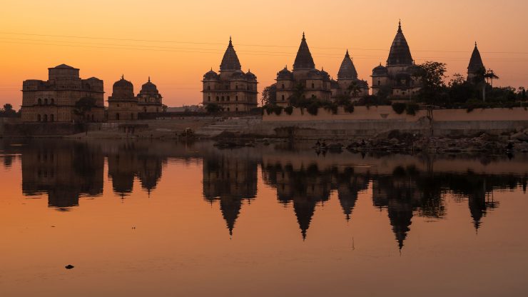
The simplest example of this is symmetry, in which one half of the photo mirrors the other half exactly (or as close to exactly as possible). This type of balance is easy for the photographer to compose and for the viewer to understand, and it can be used to create a very powerful effect. However, there are two major problems with using symmetry as a compositional strategy: first, creating a strong composition with symmetry usually requires perfect symmetry, so relatively small differences in one half of the image can be very damaging to the composition. Second, and perhaps more importantly, is that symmetrical compositions are very simple and predictable, and therefore can get boring pretty quickly.


More commonly, artists compose their images such that elements of the image are balanced according to “visual weight” or “impact” rather than literal form. Consider the simplified image in the example below:
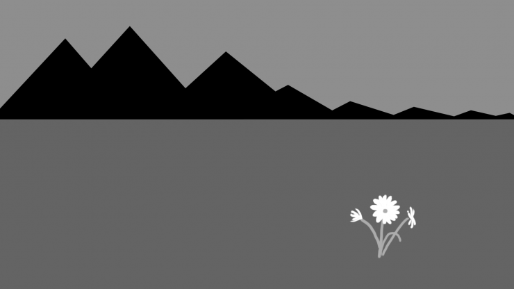
In this image, there are two main elements: the large, black mountains in the upper left, and the white flower in the lower right. Within the limits of my crude artistry, this image is well balanced. Why? The mountain is much larger than the flower, they’re not similar shapes, there’s no symmetry.
The answer is more dependent on the psychology of the observer than the specific shapes and forms. When an image is mostly dark, our eye is attracted to areas and objects that are bright. For that reason, the (relatively small) flowers in this image have much more “visual weight” than the larger, darker mountains. If we draw a vertical line down the center of the image, notice that each half of the shot is equally important to the overall image… and in fact, the same is true if we bisect the image with a horizontal line.

For some people, the balance may be easier to see when the image is out of balance. Suppose that the “photographer” had taken a few steps to the right and shot the image with the flowers on the left. As you can see, the right side of the image seems empty and a bit superfluous. In fact, it almost seems that the left side of the image would work nicely as a square image, with the rest of the frame cut off.
Bright areas are not the only elements that carry extra weight. In fact, there are too many specifics to list, and they can be dependent on an emotional response from the viewer just as easily as formal factors. A partial list might give you a good starting point, though:
- dark areas in an otherwise bright image
- bright colors in an otherwise monochrome or drab image
- a contrasting color in an image containing mostly similar or complimentary colors
- faces, especially eyes
- human forms, especially naked ones
- areas of sharp focus in images with significant areas that are blurry
- objects that are closer to the camera carry a little more weight
- objects that are physically heavier may also carry more visual weight (depending on the observer’s experience)
- writing, symbols, and logos… particularly in unexpected places
- small areas of fine detail in large areas of open space (negative space)
It isn’t necessary to use balancing elements that carry extra weight; you can easily balance one large dark object with another large dark object, for example, but you run the risk of having multiple elements competing to be the subject of the image.

I shot the image above at Cannon Beach on the Oregon Coast. The balance strategy is very similar to that in my diagrams above it; the large, dark rock and it’s reflection in the lower-left are balanced by the smaller sea-stacks in the upper right because they are set against a lighter area of the image backed by a contrasting color.
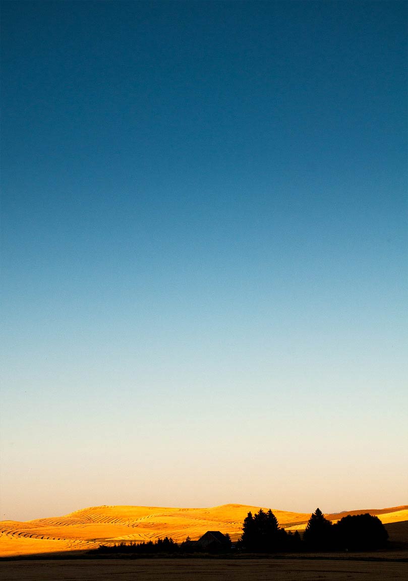
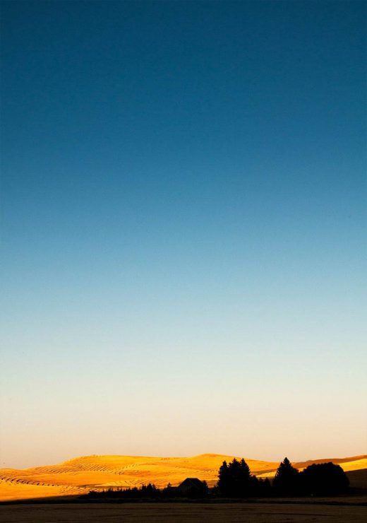
While I was shooting in the Palouse of eastern Washington, there wasn’t a cloud in the sky. To help create an open, airy feeling in some of my photos, I included large swaths of empty sky. To balance it (without overpowering it), I included small areas of the ground with sharp, contrasty detail, like the trees and farmhouse above.
Examples!
Virtually any good photograph will be an example of successful balance; my goal with this article has been to pick a few that are simple enough images to convey the concept. Again, rather than filling this gallery with my own images, I’d like to see some of yours! They don’t need to be artistically or technically perfect… simply email me your photo (any size) that is a clear example of “Balance”, and I’ll add it to the gallery below… or use the “Upload” widget at the bottom of the right column of the site, and send me a message to let me know that you’ve added something. Please also include how you’d like your name to appear in the byline, either as your username here, or your real name. Also include a line or two of text to describe what you think is going on, if you think it will help.
