Vanishing Point Perspective
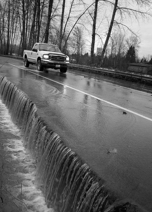
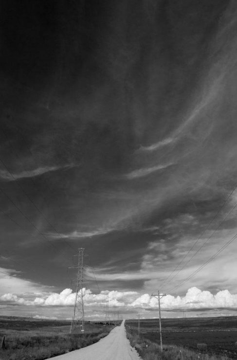
Capturing our three dimensional world in the two dimensions of a photo is inherently problematic. Without special care, it is very easy to produce an image that is flat, lifeless, and boring. Luckily, there are several techniques for creating a sense of depth in photography, and probably the most recognizable of these is highlighting the vanishing point perspective.
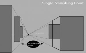

In order to emphasize vanishing point, then, it is important to include significant portions of the orthogonal lines (ie, the parallel lines that are converging), and usually, the point at which they merge (or would merge) in the distance. Using a wide angle lens exaggerates the angles of convergence, assuming that you’re close enough to the lines (or objects) that they are sufficiently large in the foreground, and consequently provides a more dramatic Vanishing Point perspective.
In addition to creating depth in a photo, the strong lines direct the viewer’s eye movement though the photo. The orthogonal lines act as “leading lines”, leading the eye deeper into an important part of the photo. Consequently, many photographers place the subject of the photo at their point of convergence, insuring that the viewer will be drawn to it. That point of convergence is also frequently placed at one of the “Rule of Thirds” intersection points, as it becomes the subject of the photo in the absence of any element that outweighs it. Keep in mind that it is also possible to have multiple Vanishing points in an image, though one is the most common. Multiple vanishing points can create an image that is more complex and interesting, but being more complex, it is harder to ensure that the viewers eye moves steadily through the photo.
Examples?
Again, rather than filling this gallery with my own images, I’d like to see some of yours! They don’t need to be artistically or technically perfect… simply email me your photo (any size) that is a clear example of Vanishing Point perspective, and I’ll add it to the gallery below. Please also include how you’d like your name to appear in the byline, either as your username here, or your real name.
[Please note that the articles in the Composition series are being published in the order that they’re completed, not necessarily in order of importance.]


