Composition Techniques: Framing

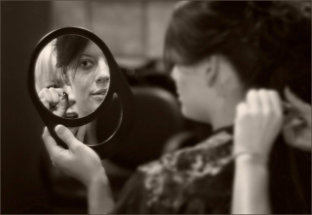
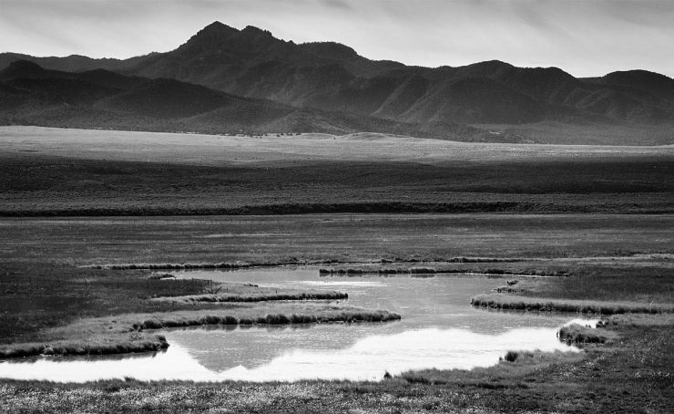
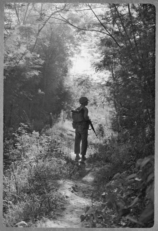
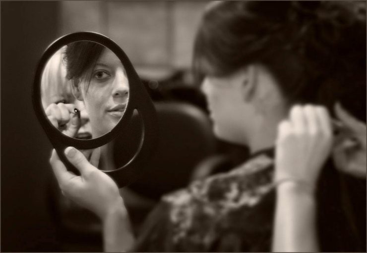
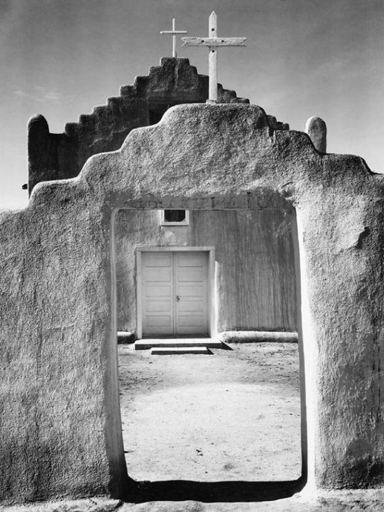
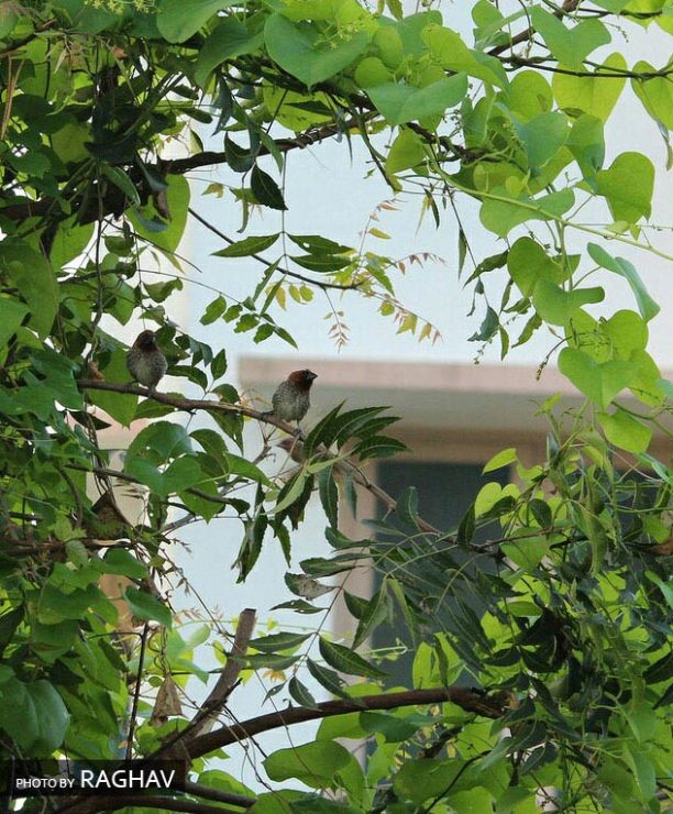
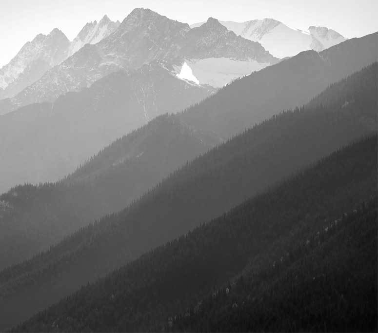
The concept behind framing (within an image) is pretty obvious: by placing some sort of visual boundary around your subject, you can draw attention to it and set it apart from the image as a whole. In more abstract work, a framed area of contrasting color or brightness might be included in the image to add depth and interest, and often becomes the subject on the strength of the contrast alone. Framing can also be much more loosely defined; I’m sure that we have all seen photos or paintings of landscapes which are loosely “framed” by tree branches in the foreground. In this sense, “framing” can refer to any set of foreground elements that keep the viewers eye from drifting off the edge of the photo. At the same time, these frames can help create depth in an image by separating the different layers: the foreground from the middle-ground, or middle from the background.
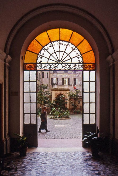
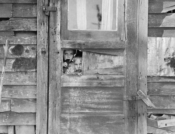
Potential frames are all around us; all you have to do is keep an eye out for them and plan your image accordingly. Some are very obvious, such as doorways and windows, but can be made very striking if they frame a dramatic subject. Wedding and portrait photographers endlessly pose their couples in convenient doorways, and journalists never seem to tire of photographing shy natives peeking through windows. And why shouldn’t they? The photos still work very well.
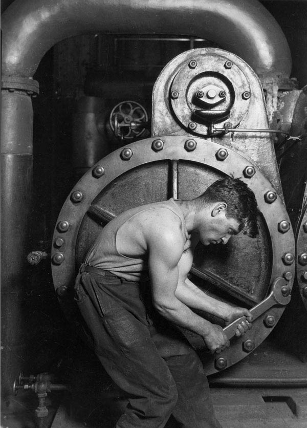
Finding other frames may take a little more attention to your surroundings. The circular, cast-iron pump cover framing the worker in Lewis Hine’s renown image from 1920 is a great example; not only does it emphasize the form of the worker, but it almost embraces him, visually emphasizing the relationship between the worker and the machine.
Of course, framing can be combined with other compositional techniques as well. If the frame is a smaller element within the image, then it can be placed according to the rule of thirds, or the subject can be placed within the frame according to the rule of thirds, for example.
Have an Example of Framing?
When I began writing this post, I had several iconic images in mind, though only a couple of them are in the public domain and reproduced here, and my own examples don’t even begin to cover the different ways of using framing. If you have an example or two, just email me a copy and I’ll add it to the gallery below! The more examples, the better, as far as I’m concerned. I’ll add more as I browse through my archives, too.
And please comment! Good composition cannot be defined by an algorithm or set of rules; I think that these posts should be viewed as a springboard for discussion rather than the definitive work on the subject.

